Read about my time at Rediker Software for more context.
Context
Rediker Software’s existing products each had their own UI with very different looks and feels. All of which were clunky and dated. There was no consistency in the user's experience when working within the Rediker Ecosystem of products. This would need to be recified.
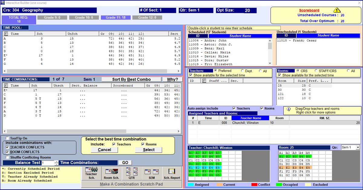
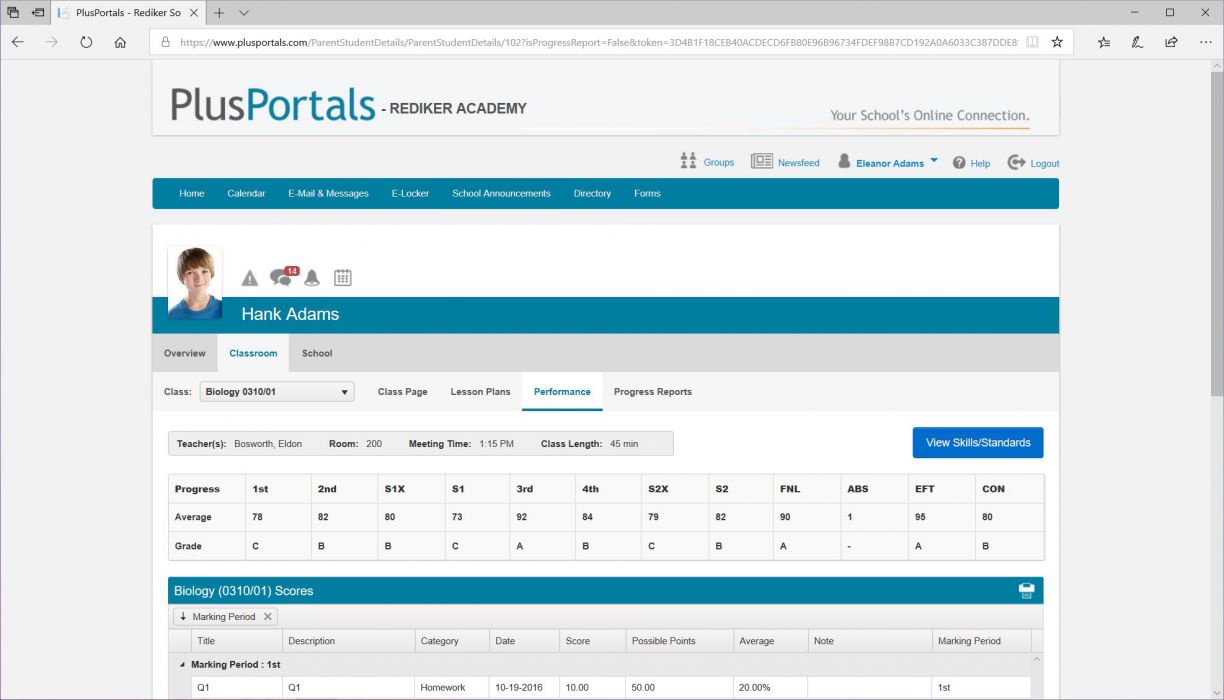
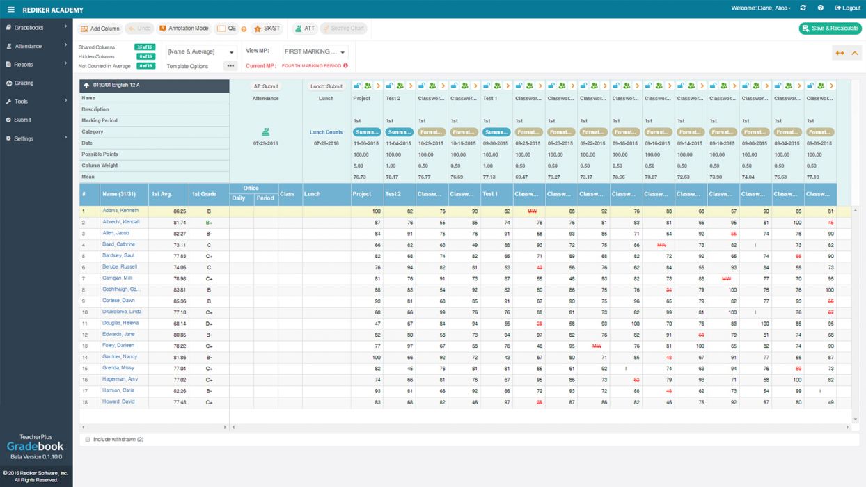
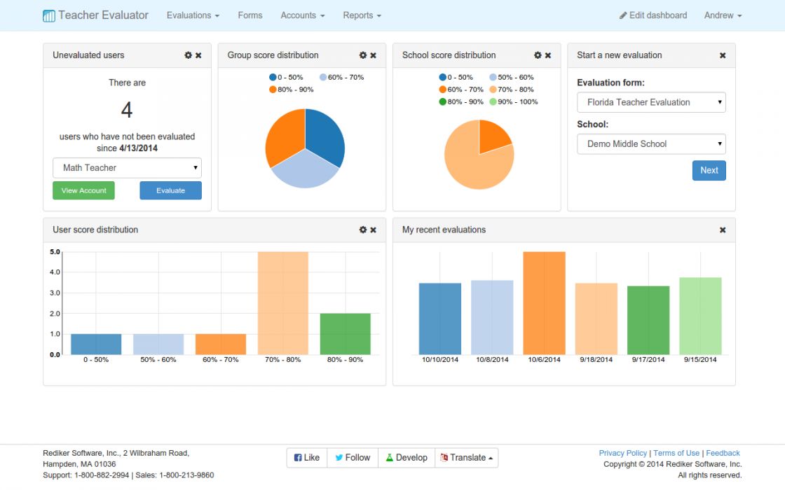
As the development of the next generation of software was started, the tech stack needed to be determined. I consulted with the lead developers and CTO to verify the framework chosen would be able to fulfill the users needs and the product strategy. It was decided that React would be used for the front-end.
Since the president of Rediker was a Google’s Material Design enthusiast, we decided to use Material-UI’s React components as a base to jump start development. Overall, Material Design is great at its foundation. It provides a lot of great UI patterns, animations and interactions out of the box. My concerns were centered around how usable some of the minimalistic UI components would be with our user base. There were a decent portion of users who were known to be technology illiterate. So, I agreed to this decision as long as I could retroactively brand, customize and add to the base components based on our users' needs.
Once another designer was hired I saw this as my opportunity to start building the Rediker Design System.
My Role
Led the creation, direction, visual design, project management, dissemination and ongoing improvements of the Design System.
The Team
- 1-4 UX Designers
- 1 Developer (on occasion)
The Tools
- Sketch with Plant
- Zeplin
- Confluence
- Storybook
Goals
- Create an accessible, clean, and approachable UI based on Material-UI components.
- Formalize a central location and design language to use for a consistent experience across all future Rediker products and teams.
- Improve workflows and communication between designers and developers with clear usage guidelines for scalability.
The Approach: Starting Small
How can we create a design system with very little resources? You start small, use an existing framework as a base and make iterative improvements to scale with the growing teams and projects.
Phase 1
- Branded Style Guide of the Atomic accessible to all Rediker employees
- A design file repository based on atomic design principles that would allow the growing UX team to collaborate, share and create mockups efficiently.
Phase 2
- Streamlining the development of existing and new components
- Component Library with guidelines
- Continuous Improvements
Atomic Elements
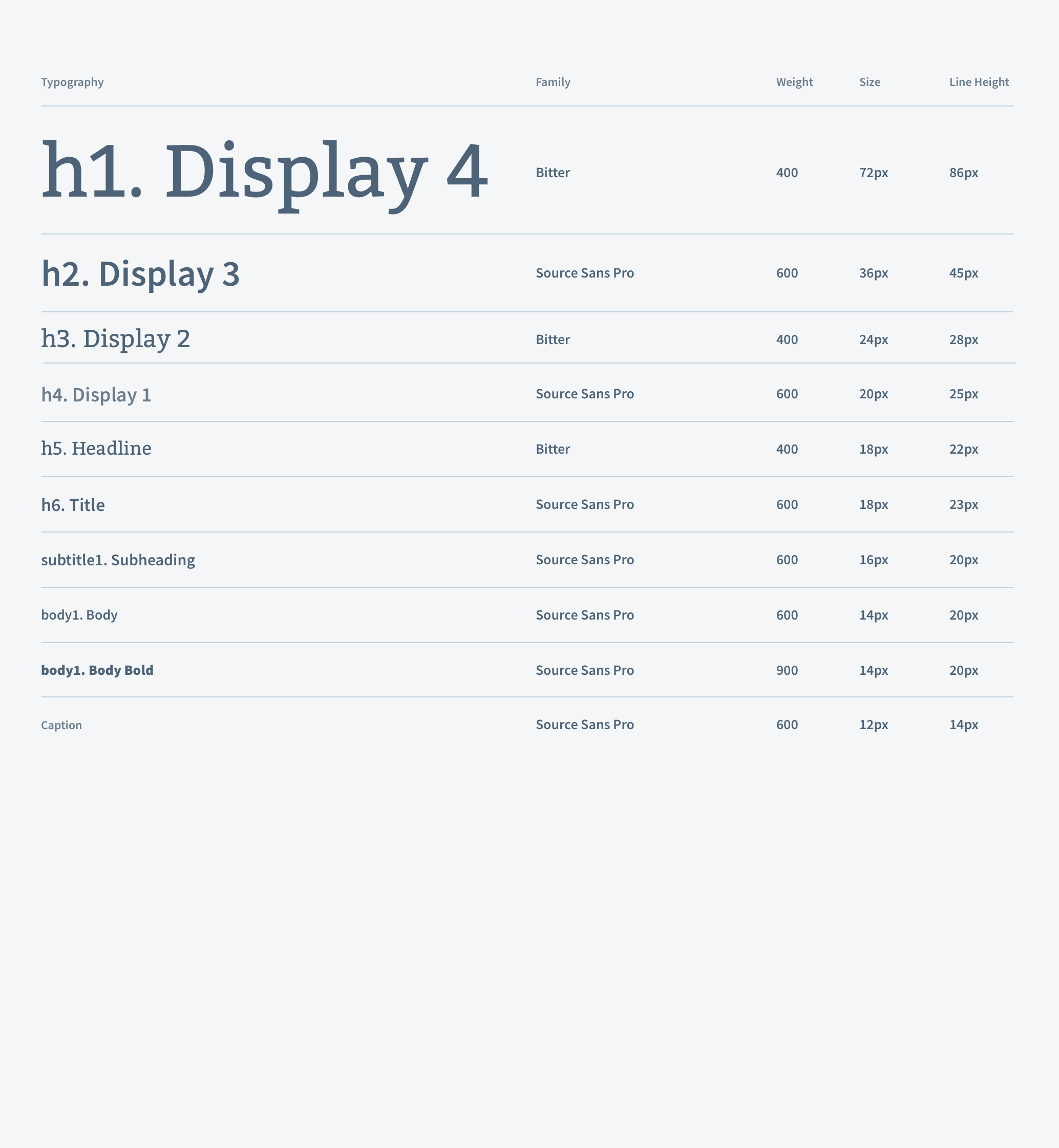
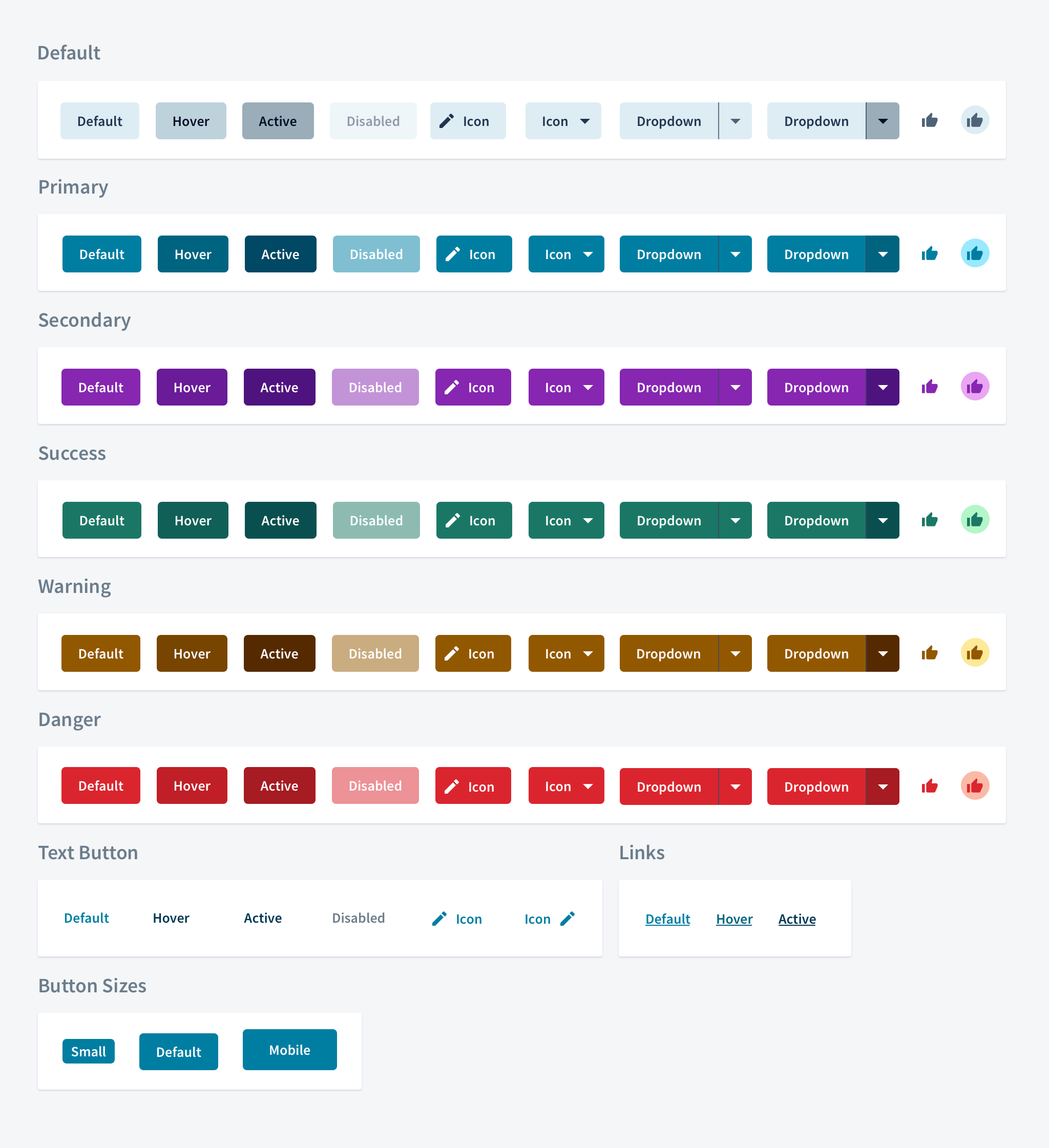
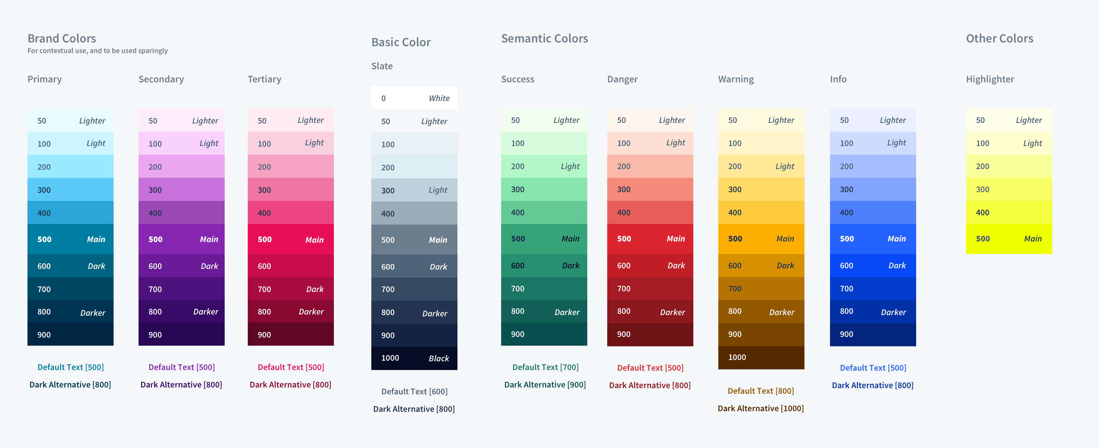
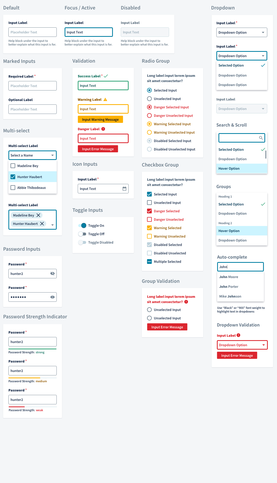
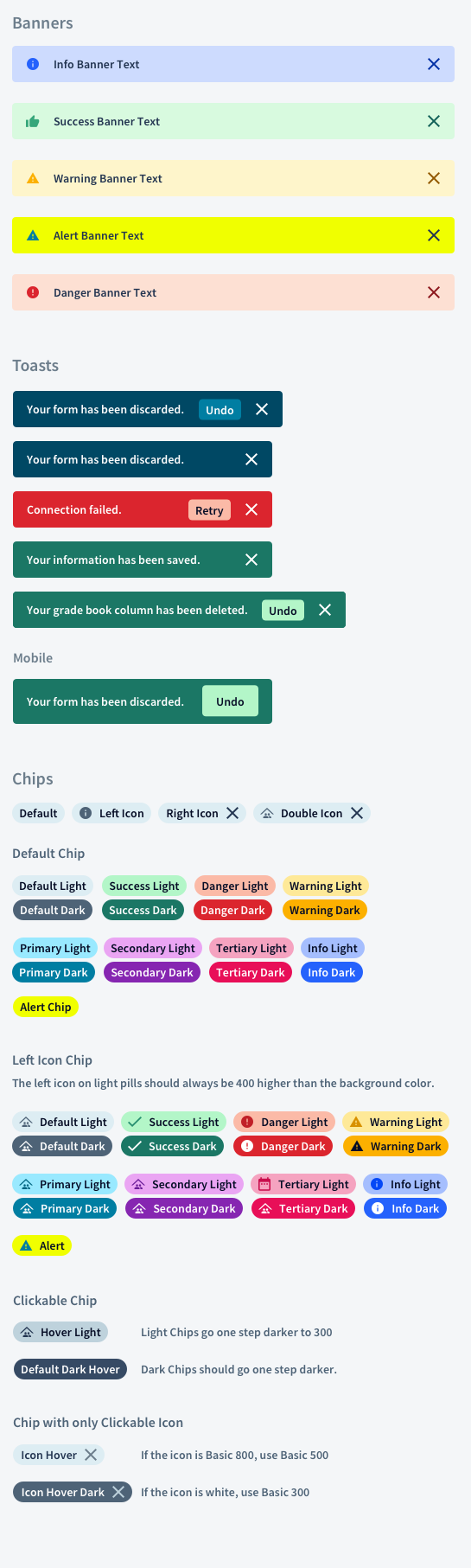
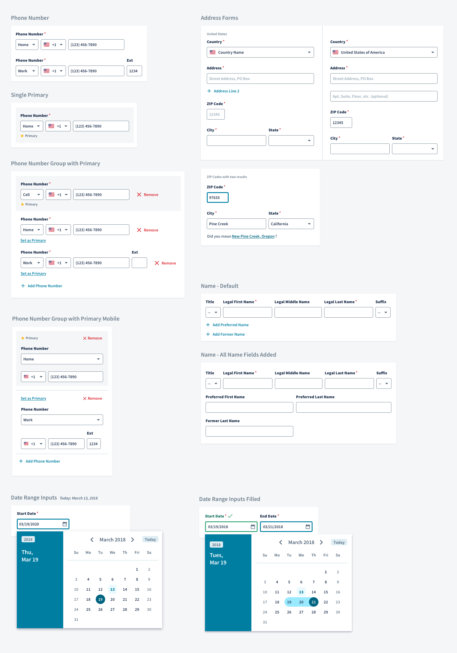
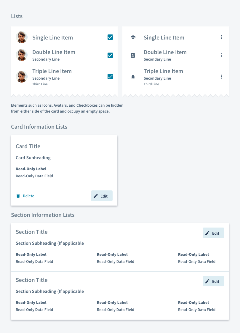
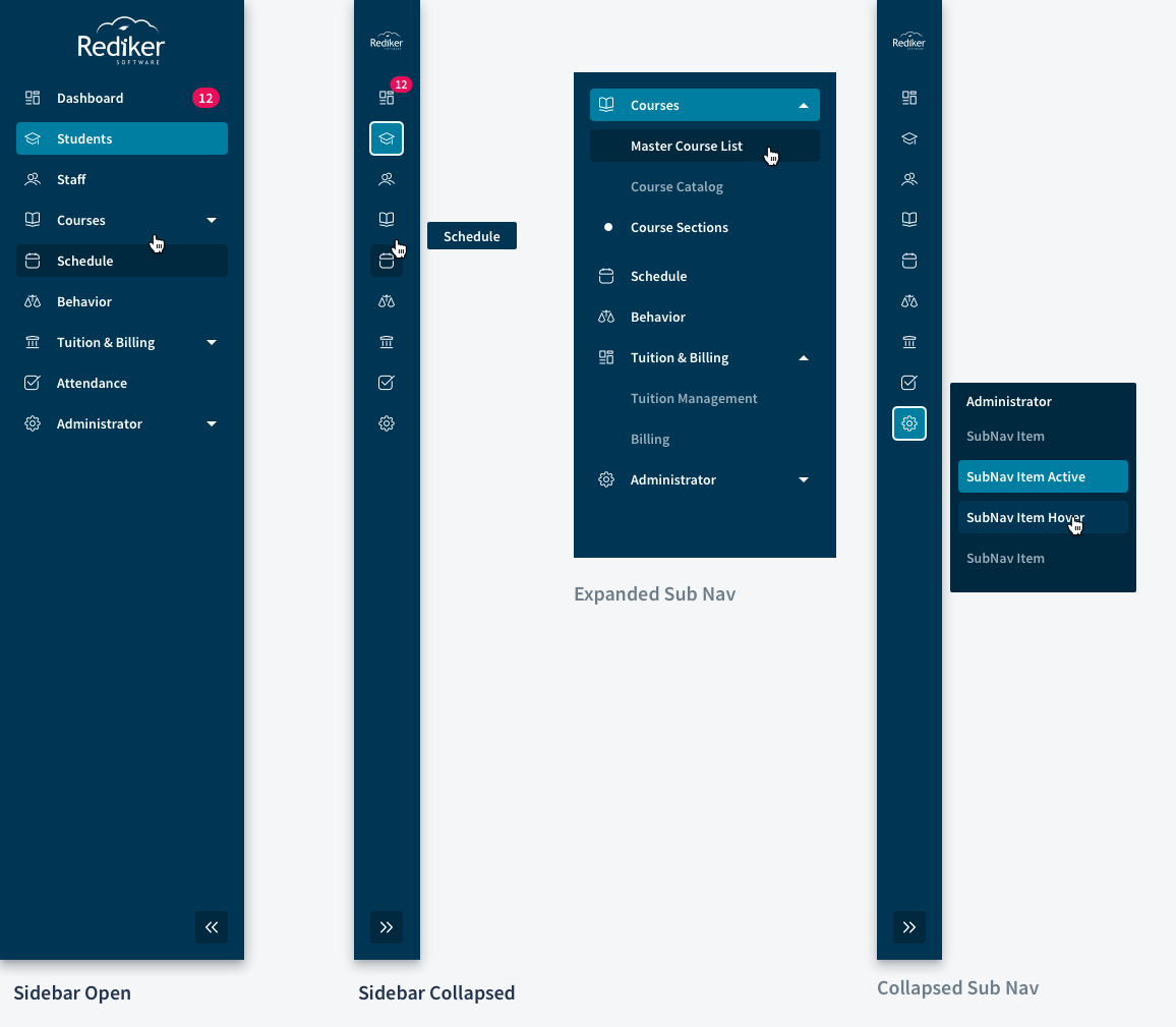
Knowing the developers would be using Material UI (MUI), we started looking at MUI’s basic components and broke them down to their smallest components. Inspired by the atomic design methodology developed by Brad Frost, we broke down our system system into four sections: atoms, molecules, components, templates and pages.
Atoms & Molecules
Components
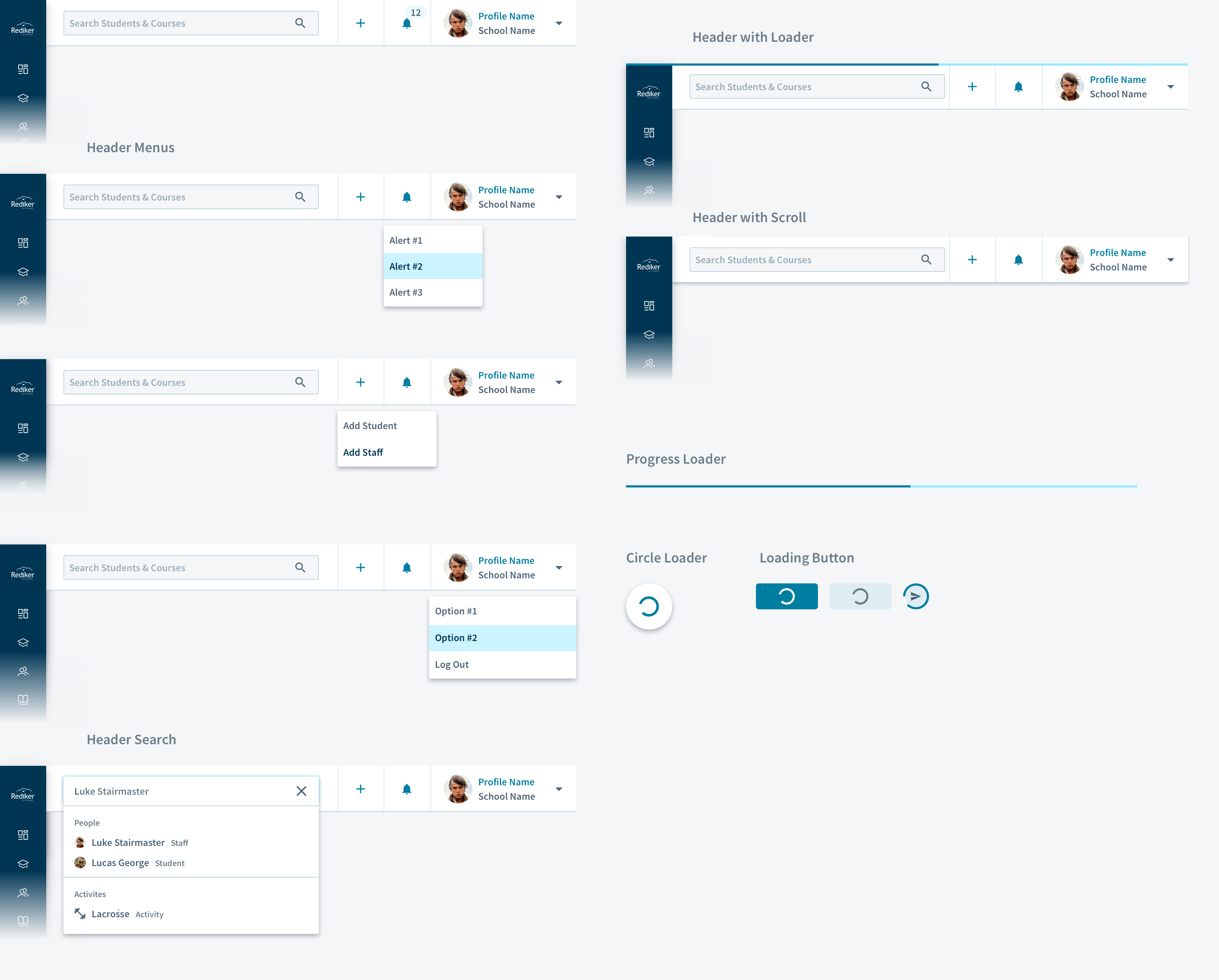
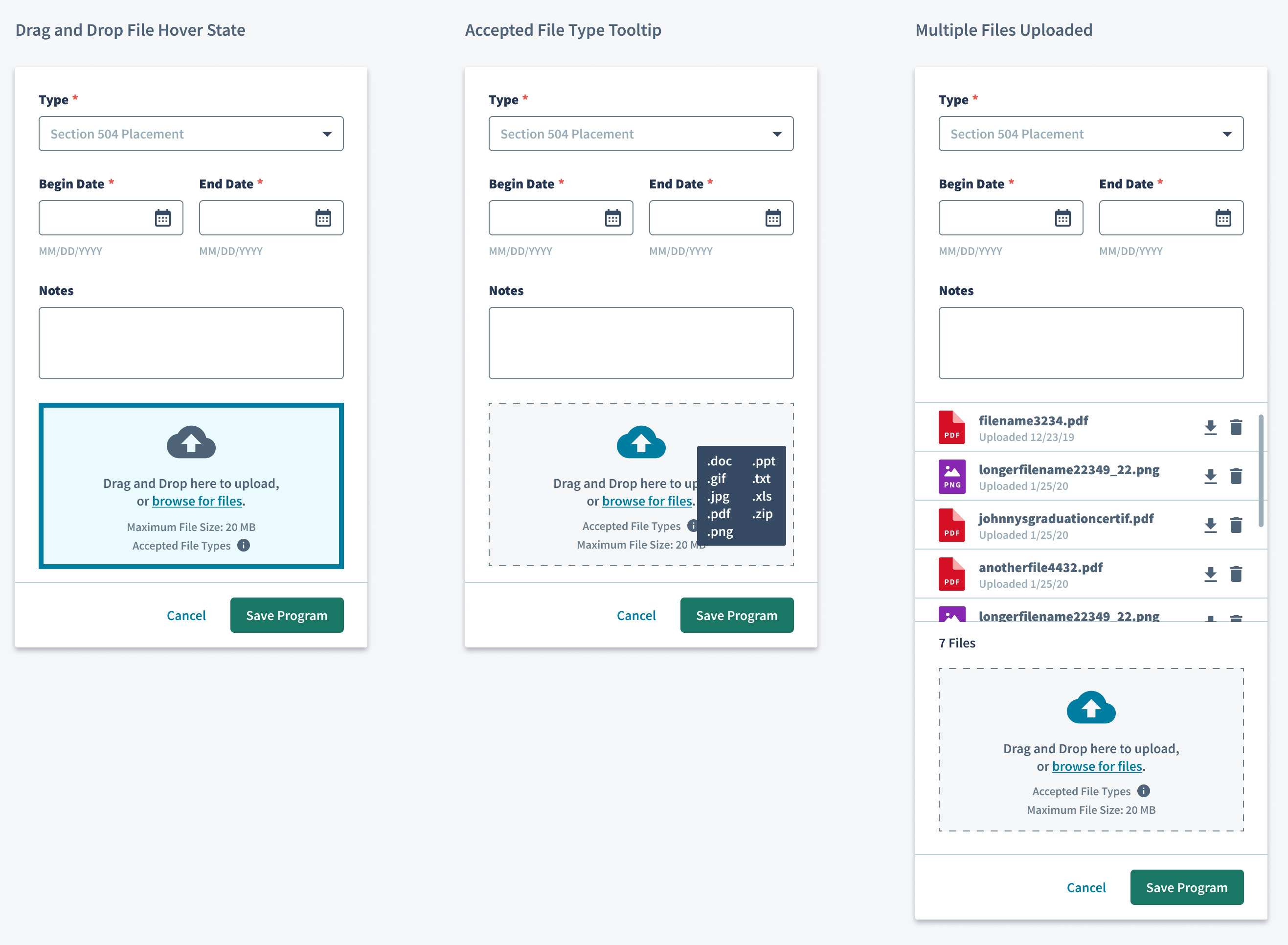
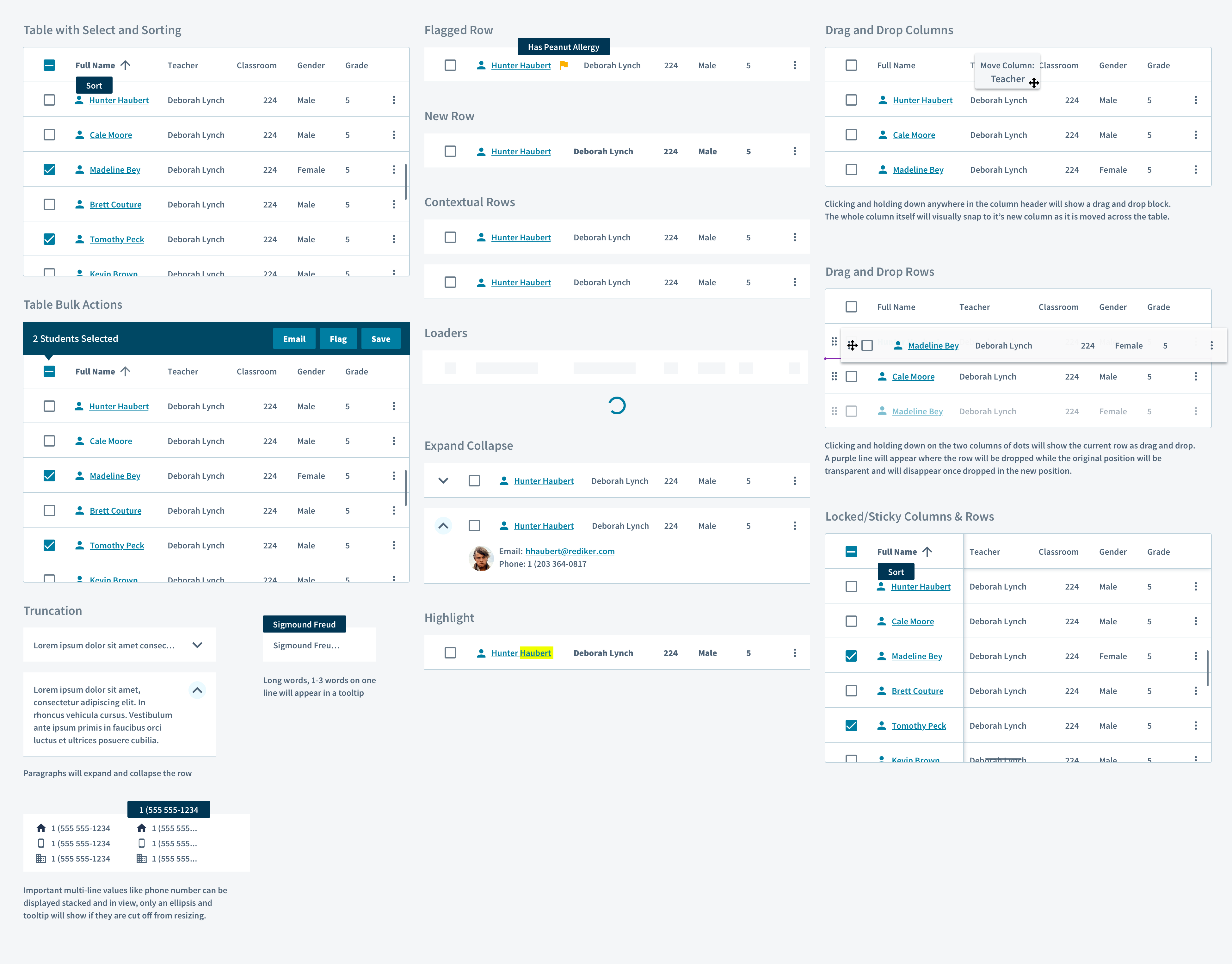
Pages
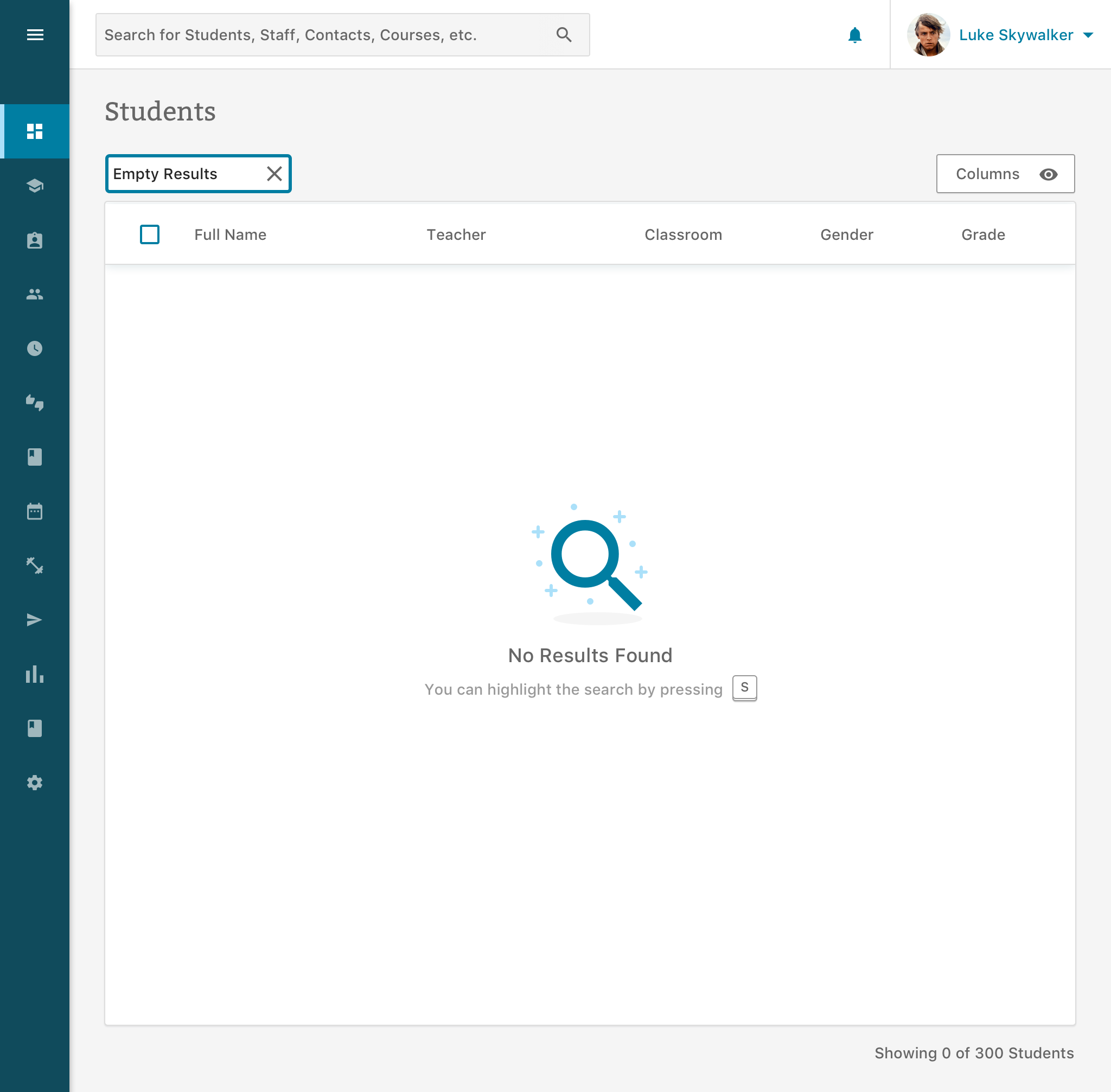
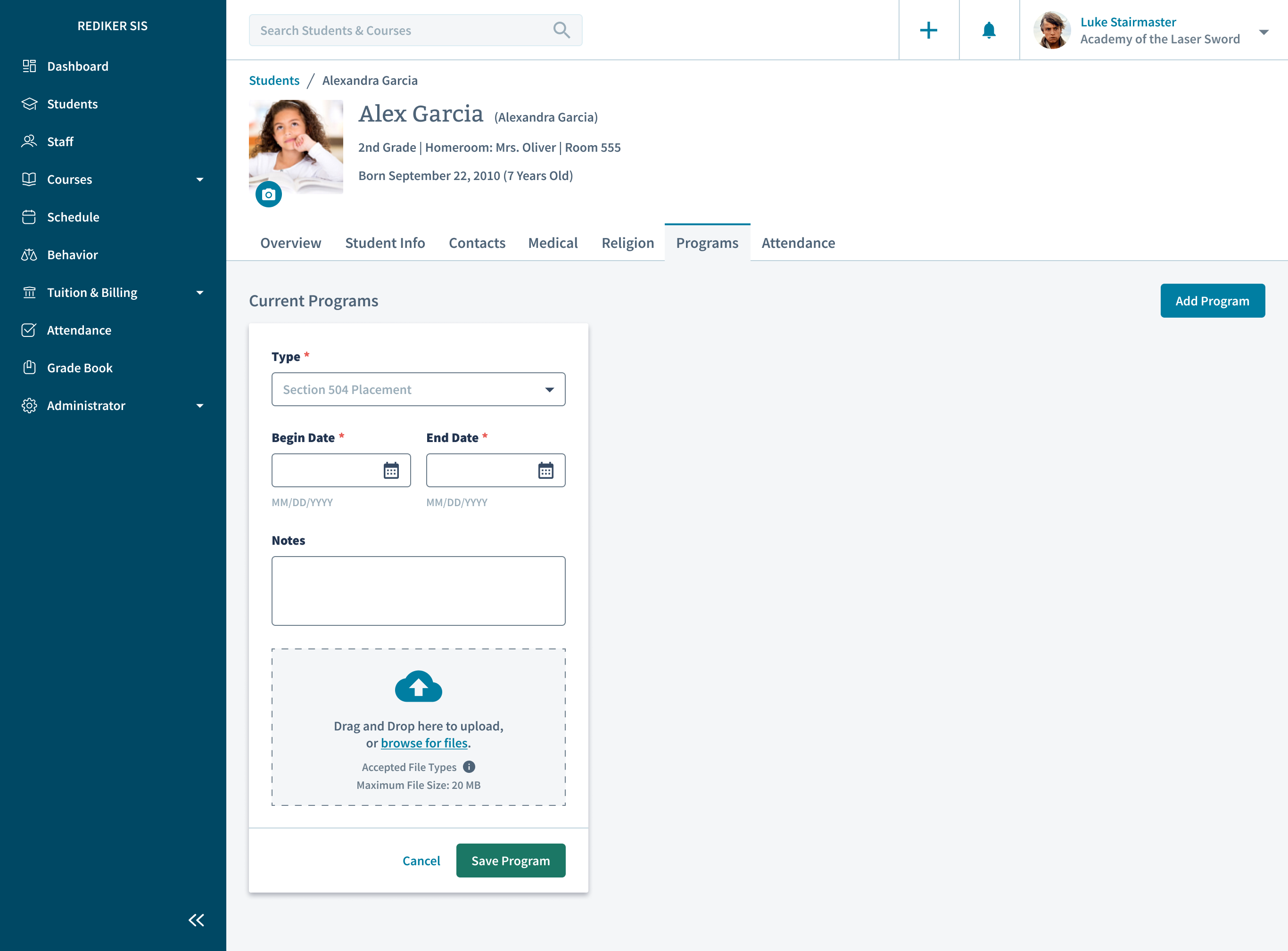
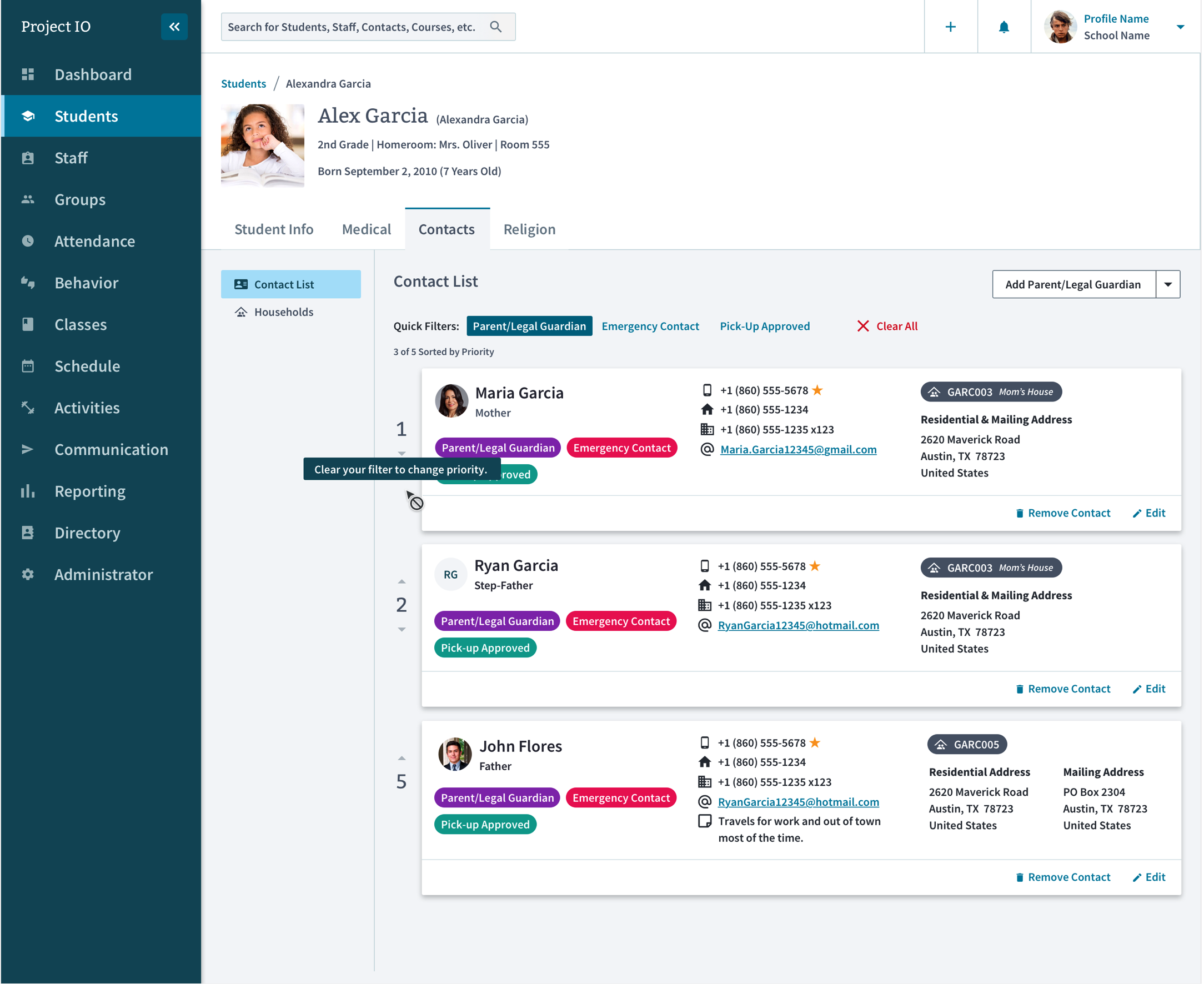
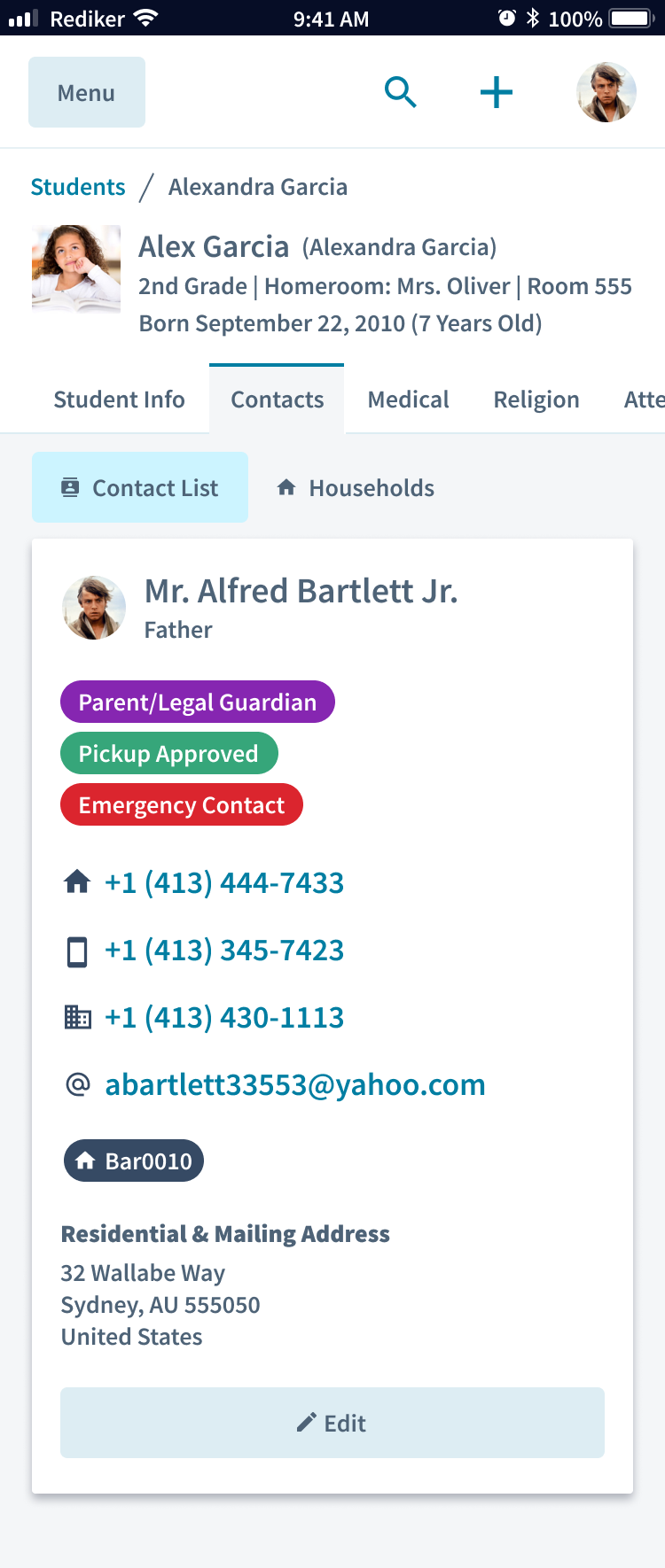
UX workflows & Sketch Libraries
Creating the static components and uploading them to Zeplin was “easy”. The hard part would be finding a balance of what components made sense as a symbol in Sketch. There was a lot of trial and error in making simple vs complex symbols and the time it took to customize them. I am still not sure I know the answer to that.
Development
Without a dedicated Design System team, the product teams were responsible for implementing the custom react components. Early on the developers decided to use Storybook as a way to catalog their react components. The UX team would work closely with the developers to make sure the base elements looked correct and behaved as we expected when interacting with each component.
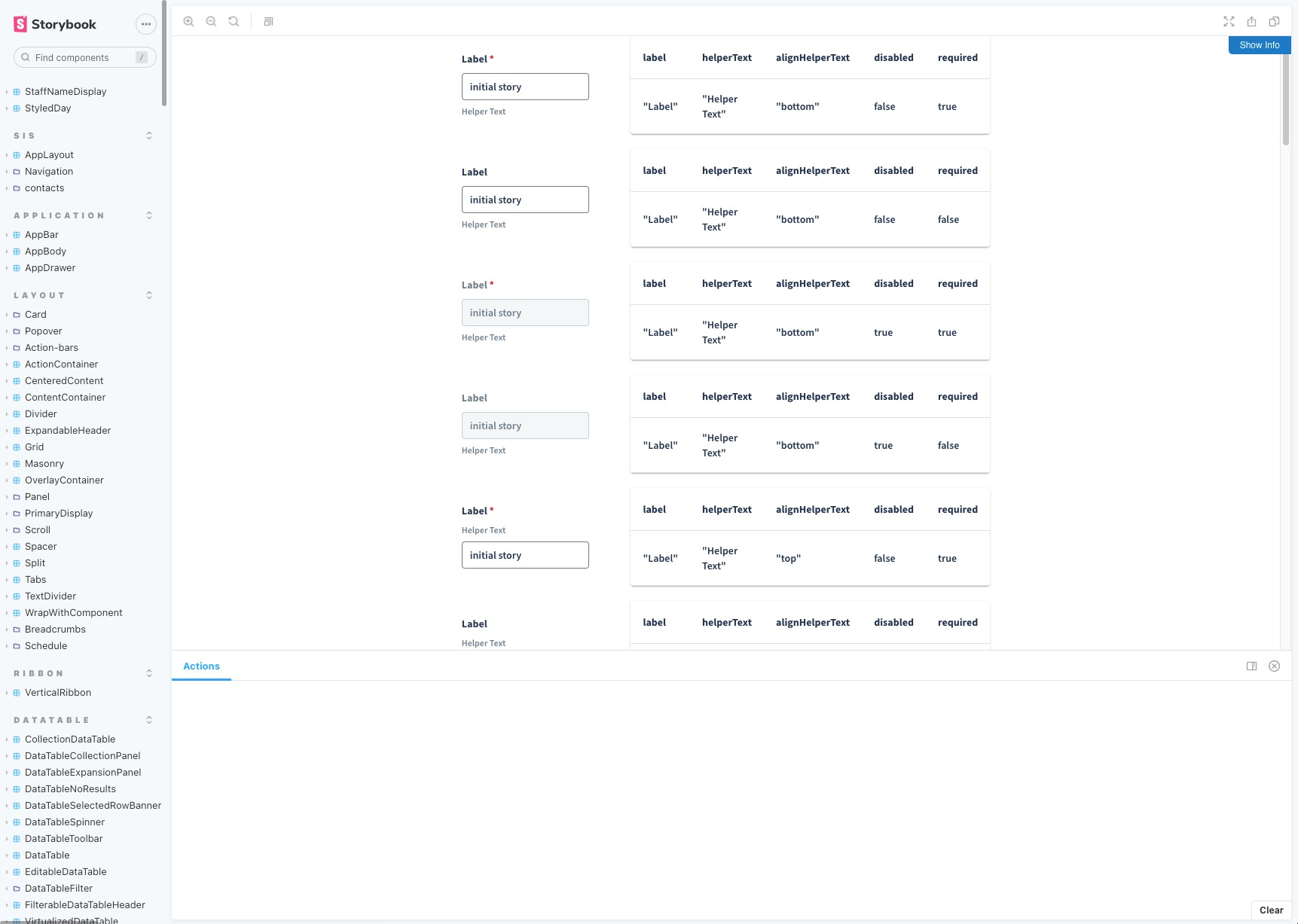
The process in which we developed the components was refined over time. The biggest lesson learned was to not preemptively implement a large number of MUI React components at once but to add them as needed for each user story.
Component Library
My dream was to have a living document with example code, guidelines and components perfectly matching the Design System mockups. Unfortunately we did not have the dedicated resources for that, instead we spread it across four applications: Sketch, Zeplin, Storybook and Confluence.
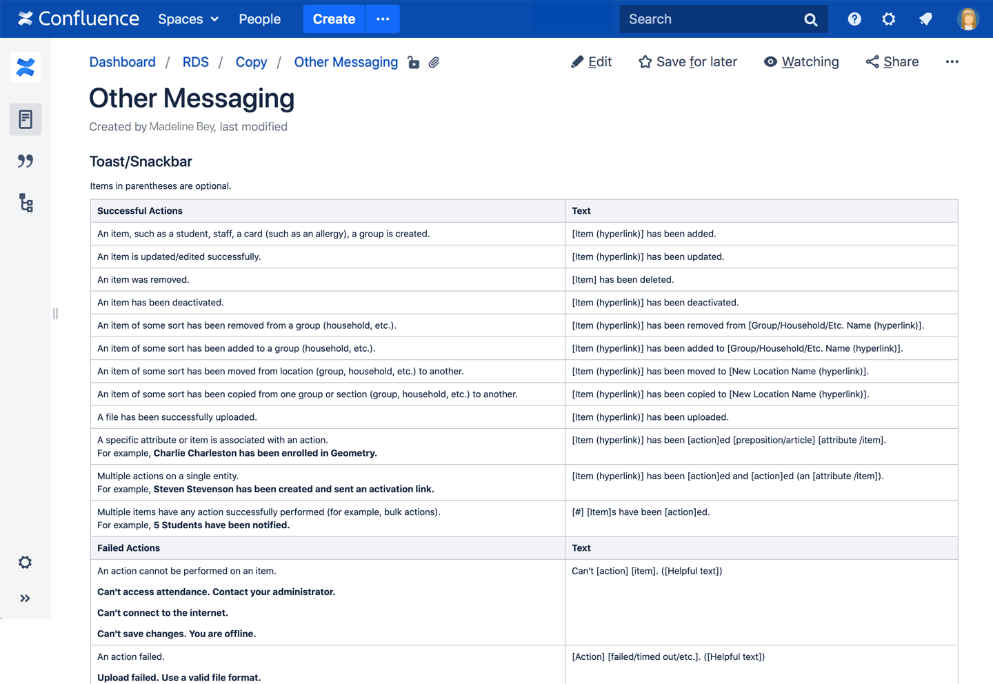
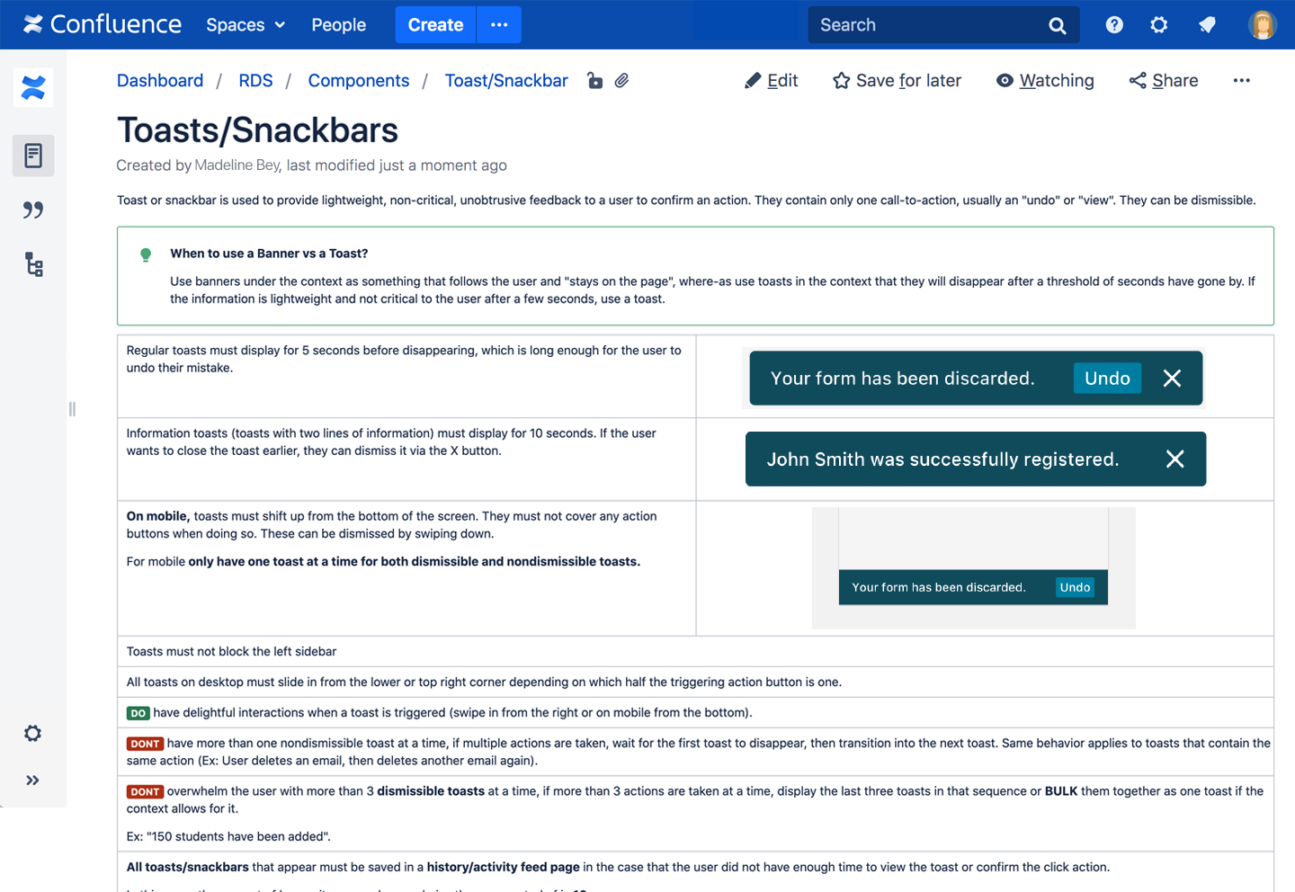
We started documenting usage guidelines to empower the developers and product owners to make sound UX decisions without always having a designers direct input.
Continuous Improvements
The Rediker Design System will always continue to stay lean and evolve to meet the needs of teams and business. With designers being part of the 2 week sprints and retrospectives there was a constant feedback loop between the developers and designers.
Key Takeaways
- Having a design system live in multiple places without direct connection is a recipe for wasted time.
- Sketch symbol overrides and application updates killed my soul. We were looking into switching to Figma.
- With a small team, stay lean and don’t design and develop elements you are not yet using in your UI.
- Be sure to document patterns as you go.