Context
In 2014, TicketNetwork’s competition in the event tickets marketplace started to rise. The company needed to pivot but struggled to adapt and scale with its technical debt. The company had decided to revisit the way they developed software with a new SDLC, as well as the framework in which all its major products were built on and unify them into one universal code base.
That August, I was assigned to the first agile team at TicketNetwork to design a new checkout platform and SSO for user accounts.
The Road to MVP
08/2014 - 10/2015
My Role
Lead UX Designer for the agile team responsible for the development of a new checkout platform.
I produced all UX deliverables including wireframes, prototypes, mockups, user testing, and visual designs.
With no web developers specializing in front-end, I took ownership of the HTML/CSS and JavaScript development.
The Team
- 1 UX Designer & Front-end Dev (Me!)
- 1 Project Owner
- 1 Project Manager
- 2 - 3 QA/QC Engineers
- 4 - 10 Web Back-end Software Engineers
- 2 Database Engineers
Business Goals
The main goals for MVP:
- A flexible and easily maintainable code base
- A list of must-have features from business
- Responsive layout (aka no longer have separate code bases for desktop and mobile)
- Create a new user account platform that fulfills the needs of checkout
- Increase conversion
- Streamline customization options for site owners
- An aggressive 12 month timeline (lots of overtime)
With these goals in mind, I worked with tech and business leaders to develop the requirements for MVP within their given time constraints to ensure that our basic user needs were fulfilled.
Research & Heuristics
Due to limited in-house UX resources (3 designers), TicketNetwork hired an outside agency, Projekt202 (P202) to jumpstart multiple large initiatives.
P202 provided the company with a competitive survey with heuristic evaluations of the company's top performing retail websites alongside its top competitors, such as StubHub and VividSeats.
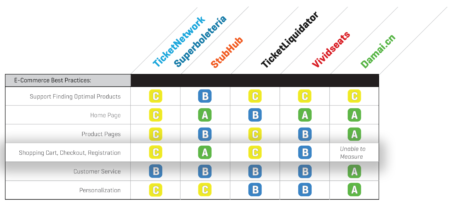
The key findings from the evaluation found that in comparison to our competitors our sites scored worse in the following:
- Uncertainty Avoidance: minimally helped to reduce uncertainty
- More thrifty versus indulgent behavior: Thrifty and lacked the support for indulgent shoppers
- Online Sophistications: very limited and lacked respect
My Goals
Based on the evaluations and my own research with the customer loyalty team, I made a list of my own goals.
-
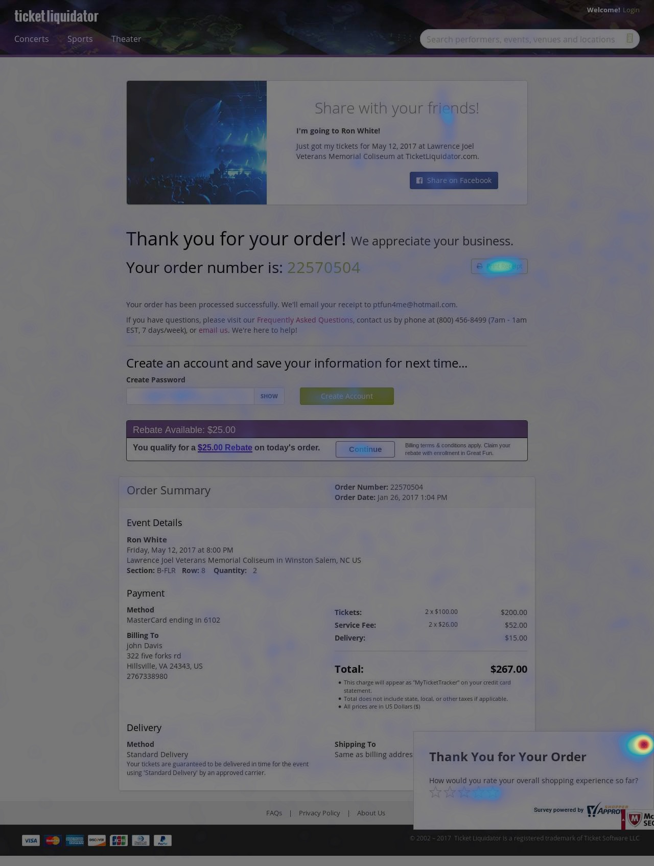
Reduce confusion around delivery methods and service fees
I had to break down silos to tap into a wealth of knowledge from the customer service representatives and the customer loyalty team. Based on the data I collected I was able to gather that these were the top two reasons customers called in for pre and post purchase.
-
Follow all best practices for accessibility and e-commerce checkouts for all user types.
Take the sketchiness out of the secondary ticket market.
The industry was started by ticket scalpers who made it a legitimate business which doesn't scream ethical. I wanted to make the checkout experience more transparent and trustworthy.
Show service fees before the last step of checkout
This would be the hardest goal to accomplish because it would mean getting buy-in from all stakeholders. Explaining to them the long term benefits instead of a fast short term gain.
-
Improve the overall experience from login to receipt.
Always prioritize the guest checkout experience.
95% of our current customers checked out as a guest.
Iterations
Wireframes
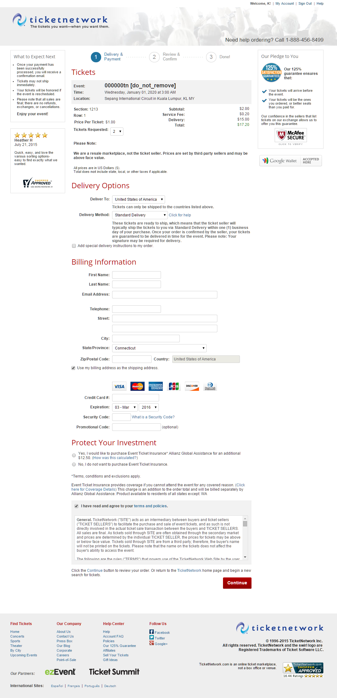
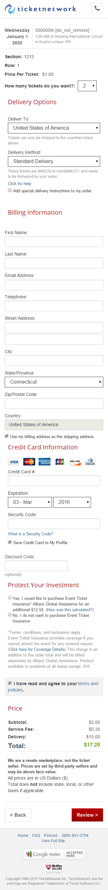
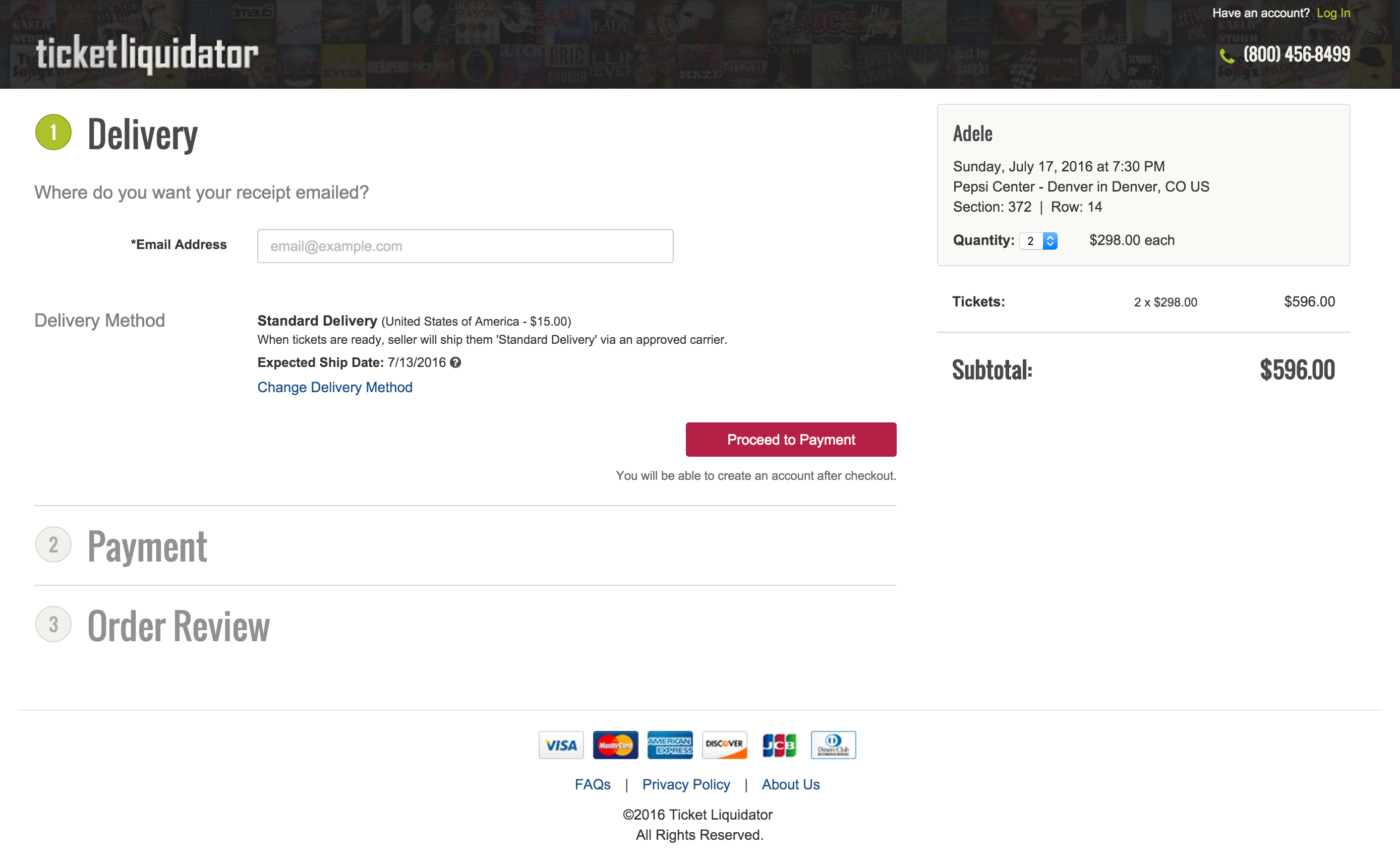
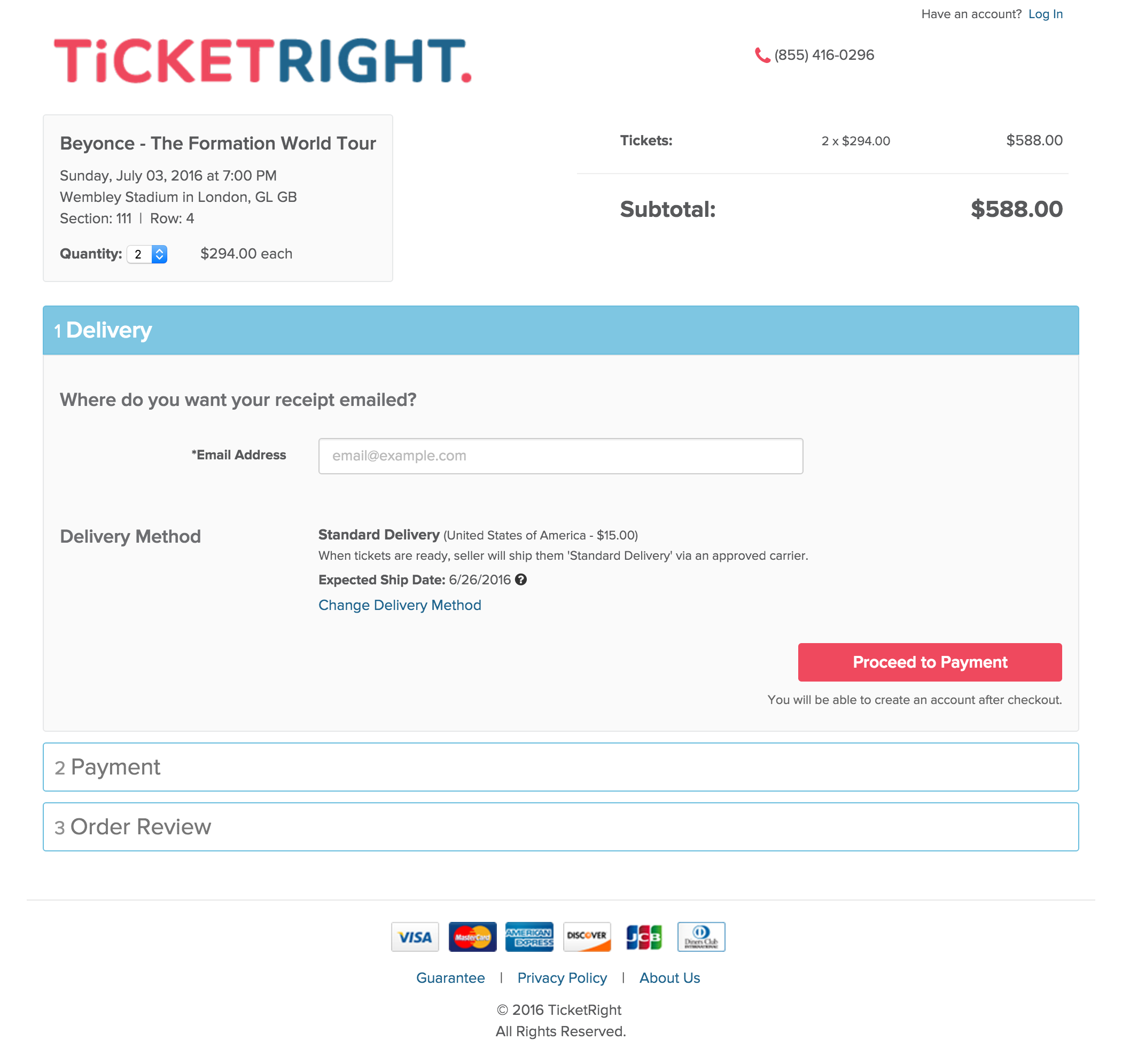
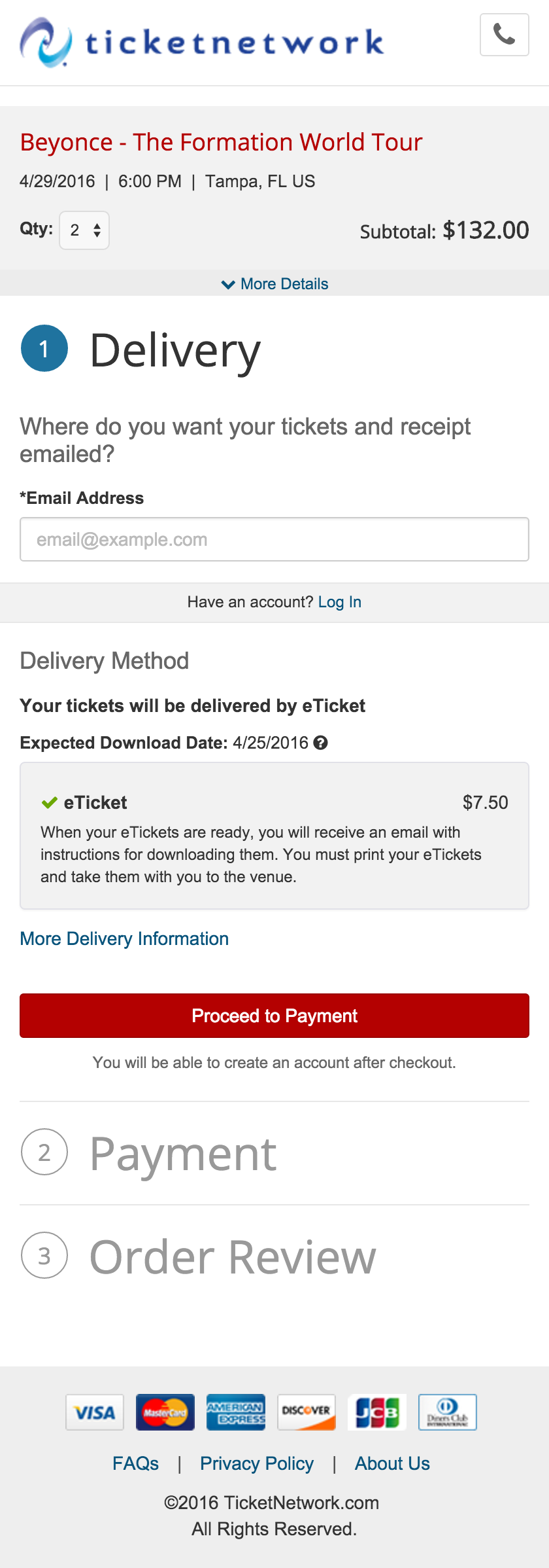
Projekt202 provided TicketNetwork with a basic set of wireframes for the checkout. They were a good start but their designs did not cover all requirements and certain industry specific scenarios, such as unusual delivery methods and dates, high service fees, responsive layout and alternative payment. While using their design as a foundation, I developed it further by designing for all the requirements and necessary scenarios, as well as producing layouts for the different breakpoints.
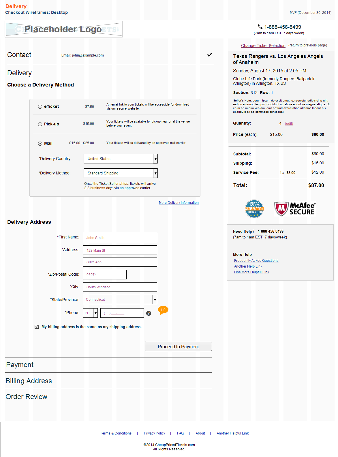
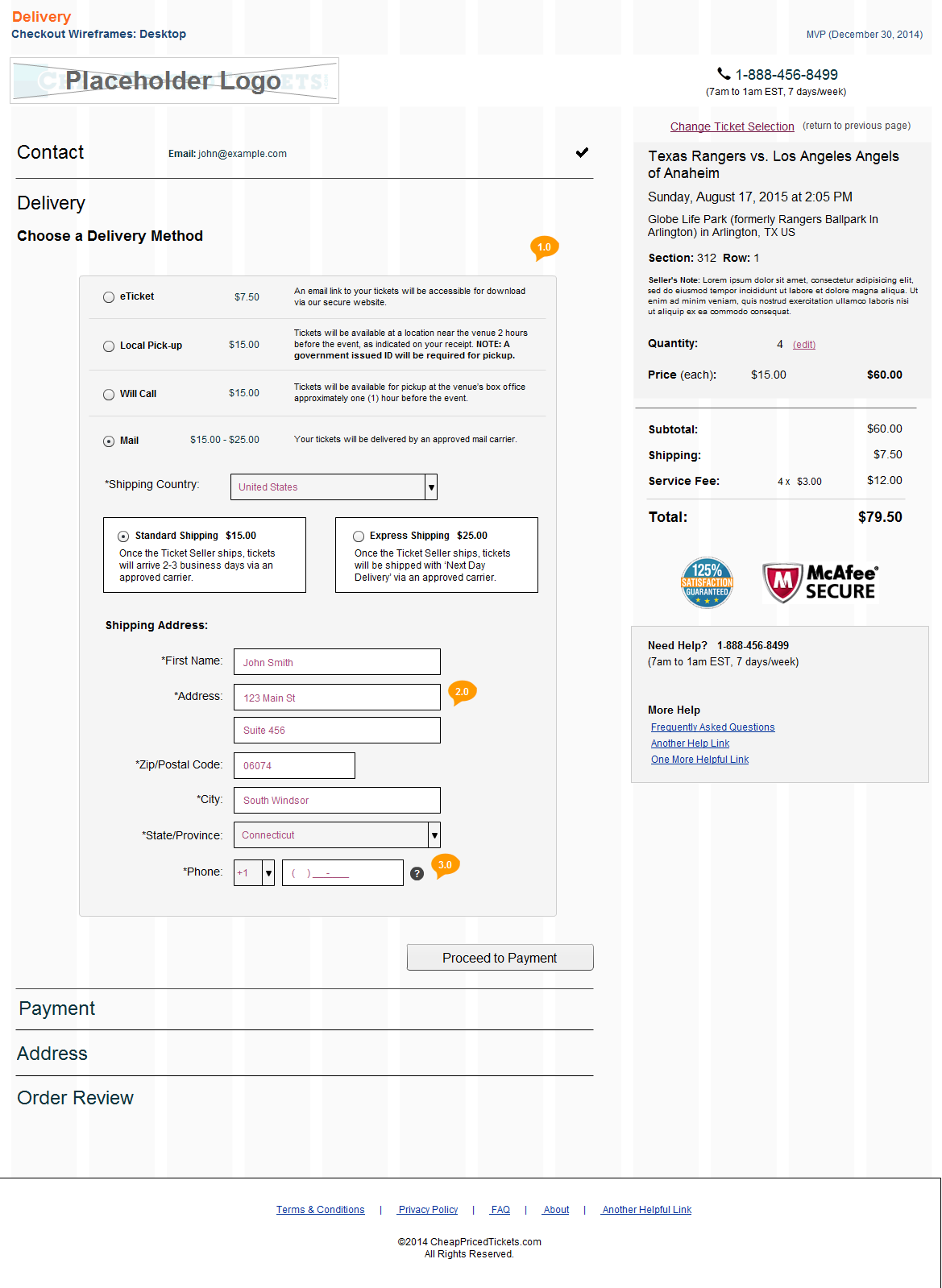
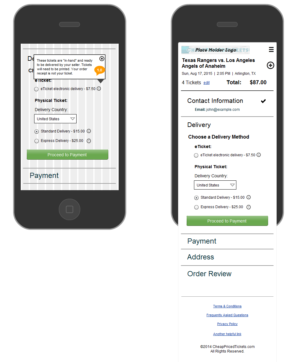
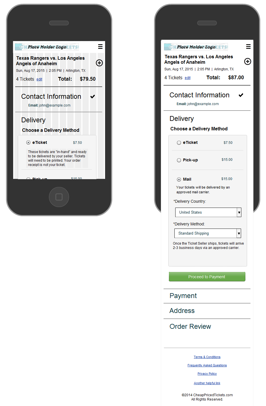
Prototype & User Testing
I moved over to Axure to create clickable responsive prototypes instead of annotated wireframes as it was faster and easier to show interactions instead of document them. There were many versions along the way with changes and updates based on feedback.
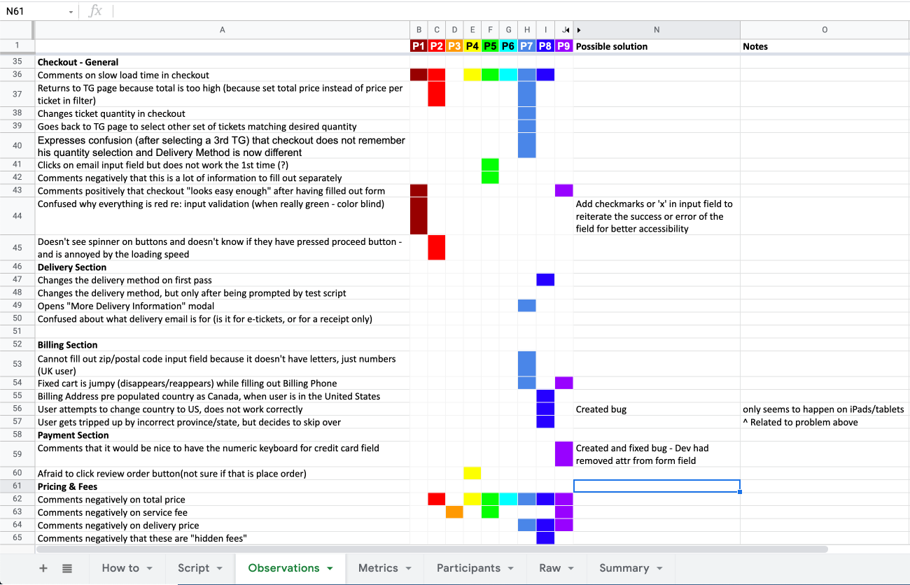
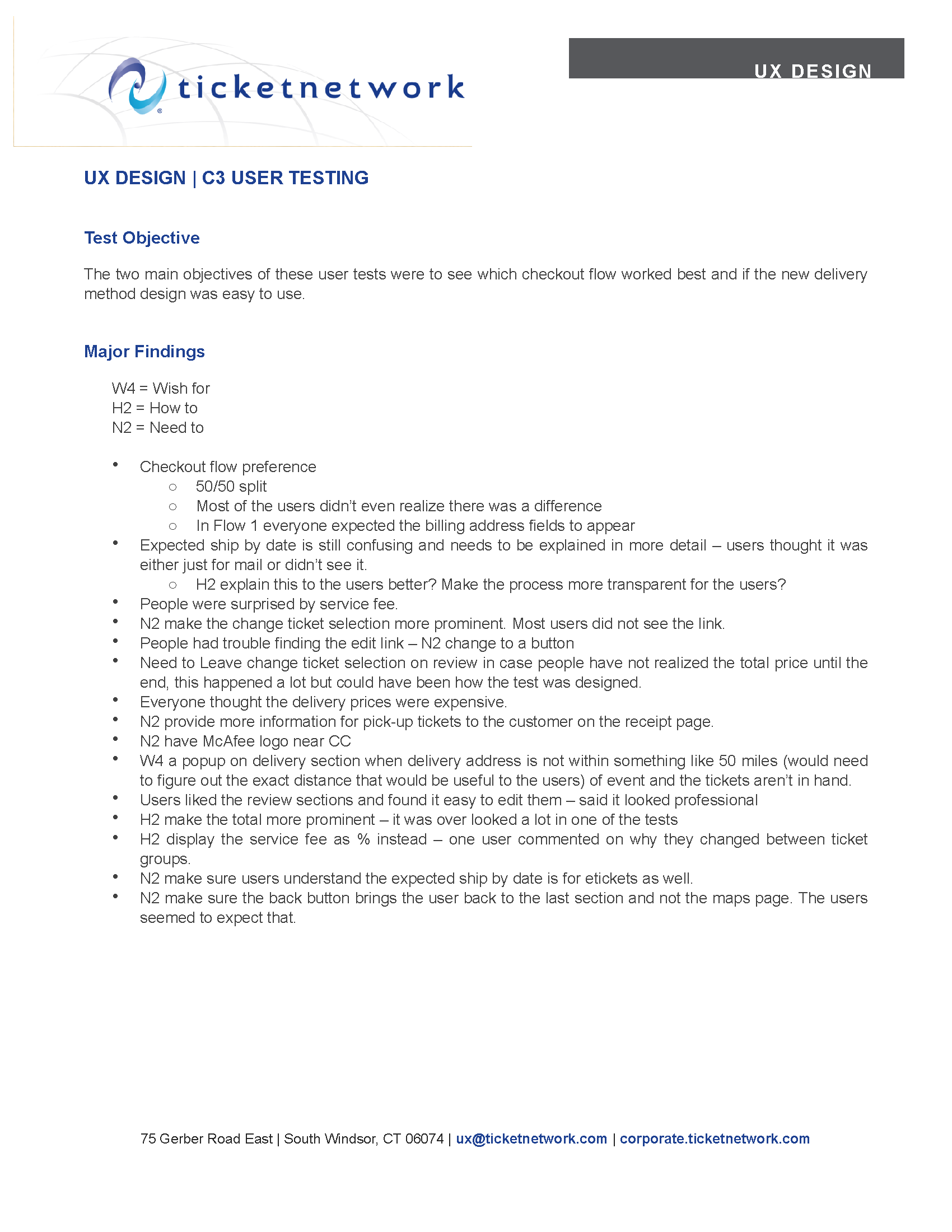
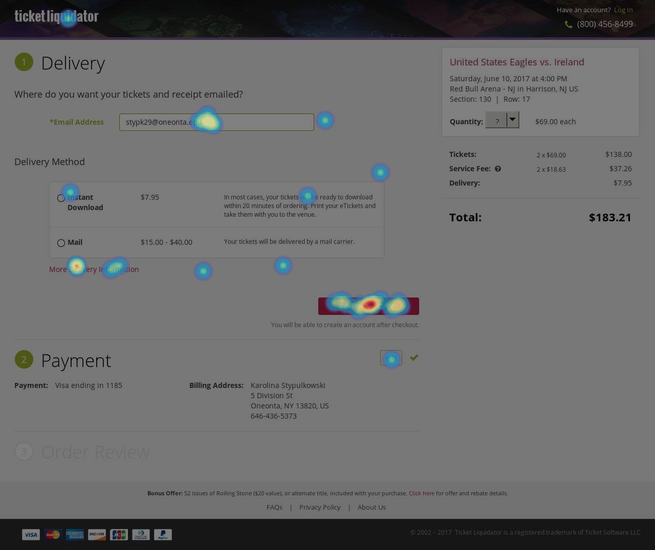
I used the clickable prototypes and morae to perform user tests in-house to test out different checkout flows and the delivery method UI. At the time, our UX team was still pioneering our way into TicketNetwork, and we didn’t have a set user testing plan in place. With a set of laptops with Morae software and no designated budget, I took the initiative to set up in-house user testing with co-workers. I created two fully functioning clickable prototypes with different layouts. I wrote the script and scheduled the testers. Additionally, I moderated the tests as a fellow UX team member took notes. I used the RITE (Rapid Iterative Testing & Evaluation) method and was able to capitalize on the ease of making quick changes to the prototypes and having testers nearby at my disposal.
To stay lean, I opted to document my results in a rainbow spreadsheet on Google Sheets which allowed for all team members to contribute their findings in one spot. This is still my favorite method to document my findings.
I knew the stakeholders would need more than just a spreadsheet with notes, so I compiled the major findings in a W4 (wish for), H2 (how to), N2 (need to) bulleted list.
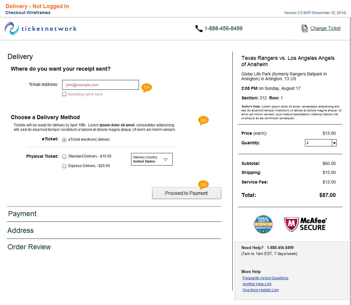
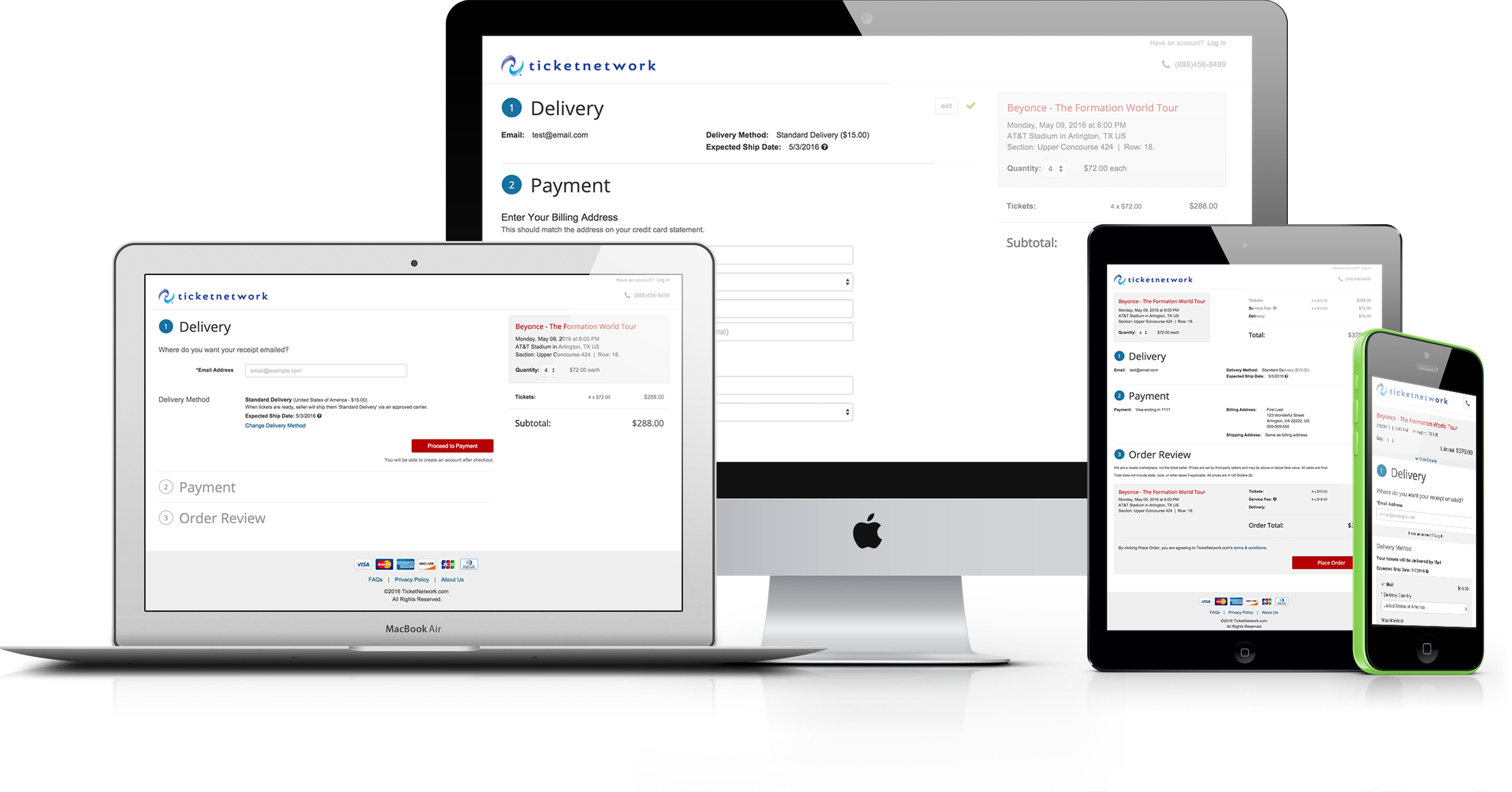
Throughout the design process there were periodic design reviews with stakeholders to make sure there was alignment. This was the end result: Final Responsive MVP Axure Prototype. Once I began coding, I would stop utilizing prototyping as much and favored coding it instead.
Front-End Coding
I started working on the front-end coding as soon as the design was stabilized. I worked in Visual Studio in an ASP.NET framework and Bootstrap for the front-end. This required close communication and teamwork with the software engineers to optimize our workflow and produce clean semantic front-end code.
I didn't want history to repeat itself, so one of my main goals with the checkout being white label was to make sure the front-end was coded to allow for easy customization. There was talk of creating a UI to allow website owners manage their branding/colors but that was far away. So I utilized LESS by creating smart variables to create a fast and easy way to integrate any new site's branding.
Outcome
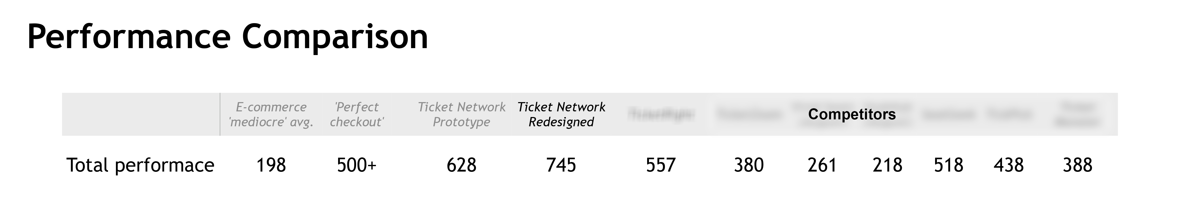
TicketNetwork hired Baymard Institute to complete a usability audit in order to assess how our checkout design compared with competitors. The audit results were positive. Our checkout received 745 points; which was 200 points higher than the “perfect checkout.”
Before the release, stakeholders deliberated about when to display the service fee. From a UX standpoint, I was in favor of showing the service fee upfront in checkout. My opinion was based on the data I collected from our customer service departments and best practices.
When TicketNetwork released MVP to our top performing websites, we performed A/B tests with Maxymiser to determine when to display service fees during the checkout flow. Based on conversion rate, the results favored hiding the service fee until the last step of checkout by 38%.
Unfortunately there wasn’t any tracking in place to determine what kind of repercussions this might have on other metrics. Such as customer satisfaction and the loss of returning customers.
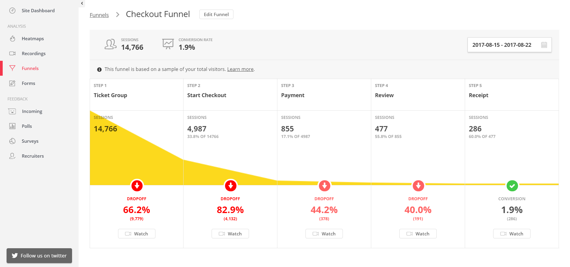
Impact
As of February 2016, 4 websites were utilizing the new checkout, with the plan to roll it out to more as quickly as possible. Conversion rates had risen 25% on our two top performing retail sites within the first 4 months of its release. Within a year of the release of MVP, hundreds of our sites had adopted the new checkout.
Continuous Testing & Discovery
In my efforts to continually improve the checkout experience, I established a process that would allow any designer on the team to continually collect data on our users' experiences.
I set up recurring biweekly unmoderated remote usability tests at the end of every sprint. As well as HotJar and record real user sessions and view heat maps. This helped with identifying where users were struggling and at what point they abandoned the checkout.
Roadmap
I was able to work with the Product Owner to prioritize UX improvements within the existing roadmap of the product. I left the company about a year after the release of MVP and in that time I led the UX efforts for improving the checkout and implementing the two major feature releases that included alternative payment methods: ApplePay and PayPal and subscription services.