Context
The roadmap for the new checkout (version 3) platform had always included the development of a new and improved management system (C3MS) but was not being prioritized.
The previous checkouts management system was inefficient and too outdated to be utilized. The only way to upgrade a new site or make changes to tracking codes, settings or branding was through developers doing manual code pushes.
Once the company saw the success of the checkout on the first four websites, the demand rose quickly to implement it on as many sites as possible. Doing manual code pushes was just not scalable, so the development of C3MS was quickly prioritized and the project kicked-off.
My Role
I was lead UX Designer and assisted on product strategy and management.
I was responsible for the user research and all UX deliverables including wireframes, prototypes, mockups, user testing, and visual designs.
The Team
- 1 UX Designer
- 1 Project Owner
- 1 Web Developer
- 1 DRM Resource
- 1 QA/QC Engineers
Approach
The Checkout Management System would consist of three main parts:
-
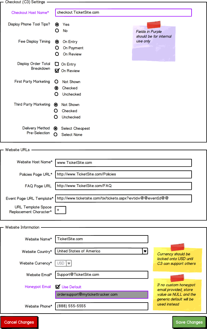
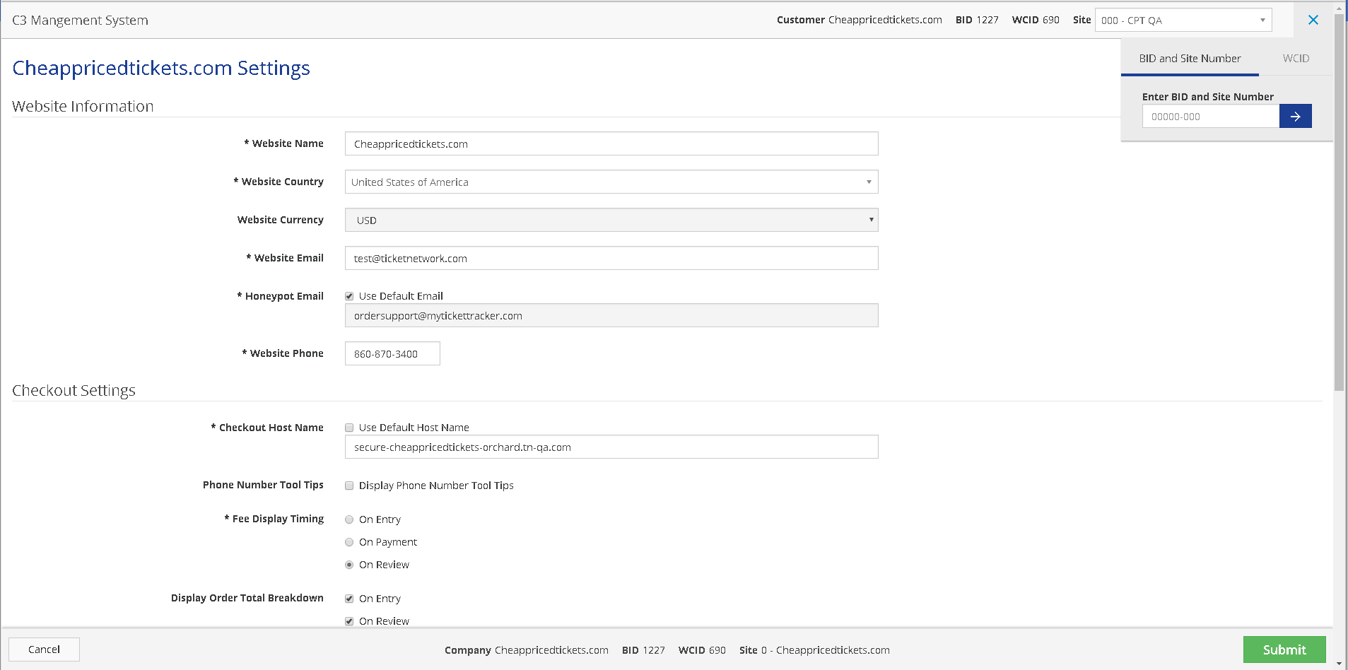
Configurations & Settings (MVP)
This would allow for each site owner to configure settings on things such as: delivery pre-selections, showing service fees, email marketing, tax notices and cart expansion functionality.
-
Tracking Code Management (MVP)
This would allow for each site owner to configure settings on things such as: delivery pre-selections, showing service fees, email marketing, tax notices and cart expansion functionality.
-
Branding Management (Non-MVP)
Allow site owners the ability to brand their own sites without the need to submit a support ticket to Web Support.
With a very tight deadline of 2 months to complete MVP, I met with the Product Owner and tech leads to determine a course of action.
We would be creating a new stand alone app using Angular JS Material. The first release would be the configuration page because of its simple UI. That would give us time to flesh out the designs and requirements for completing tracking code management.
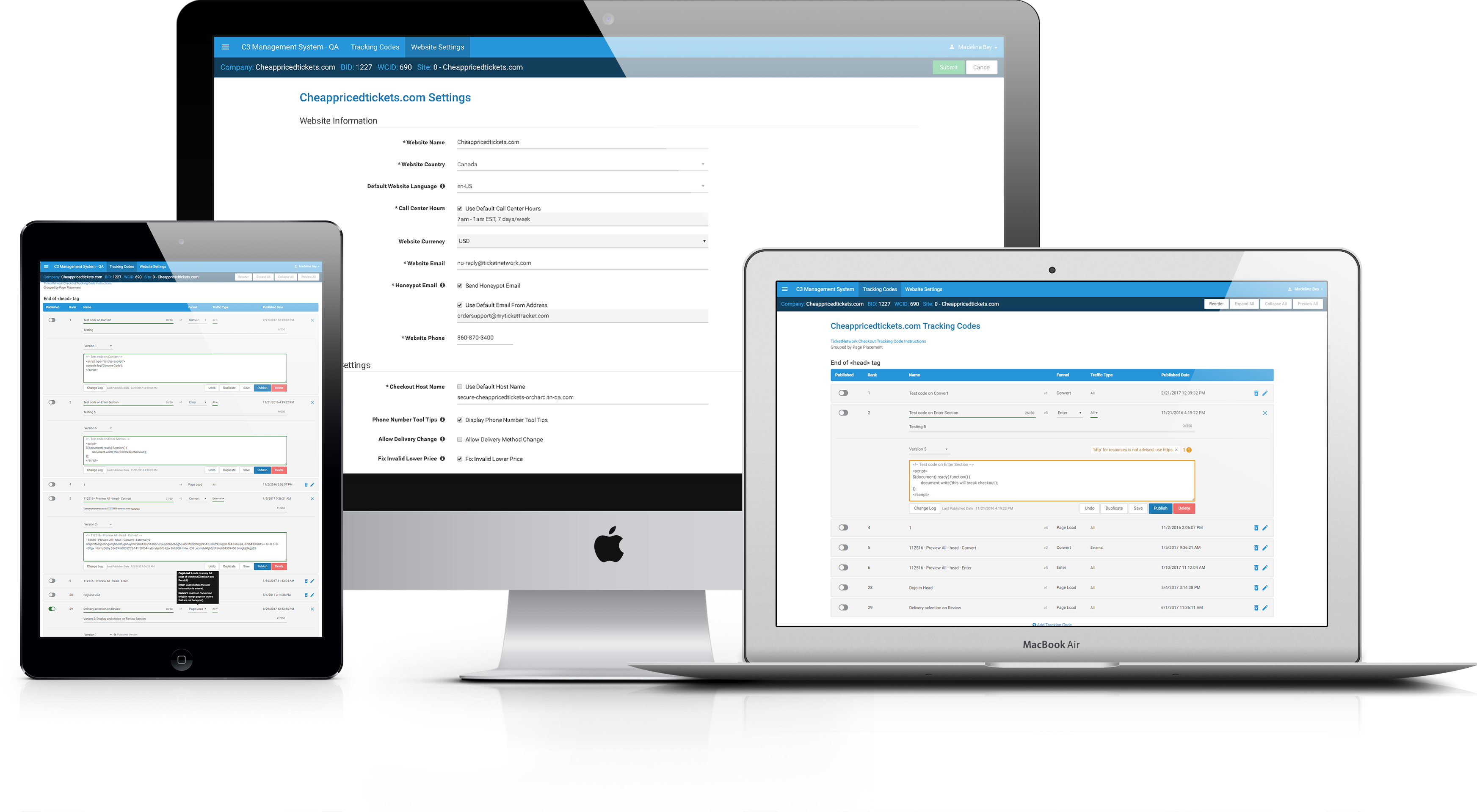
Configurations & Settings
Since this was an internal app and to save time, we were using Angular JS Material components as is. We would be updating the theme to match TicketNetwork’s branding. All that was needed was this simple wireframe and the developers got to work.
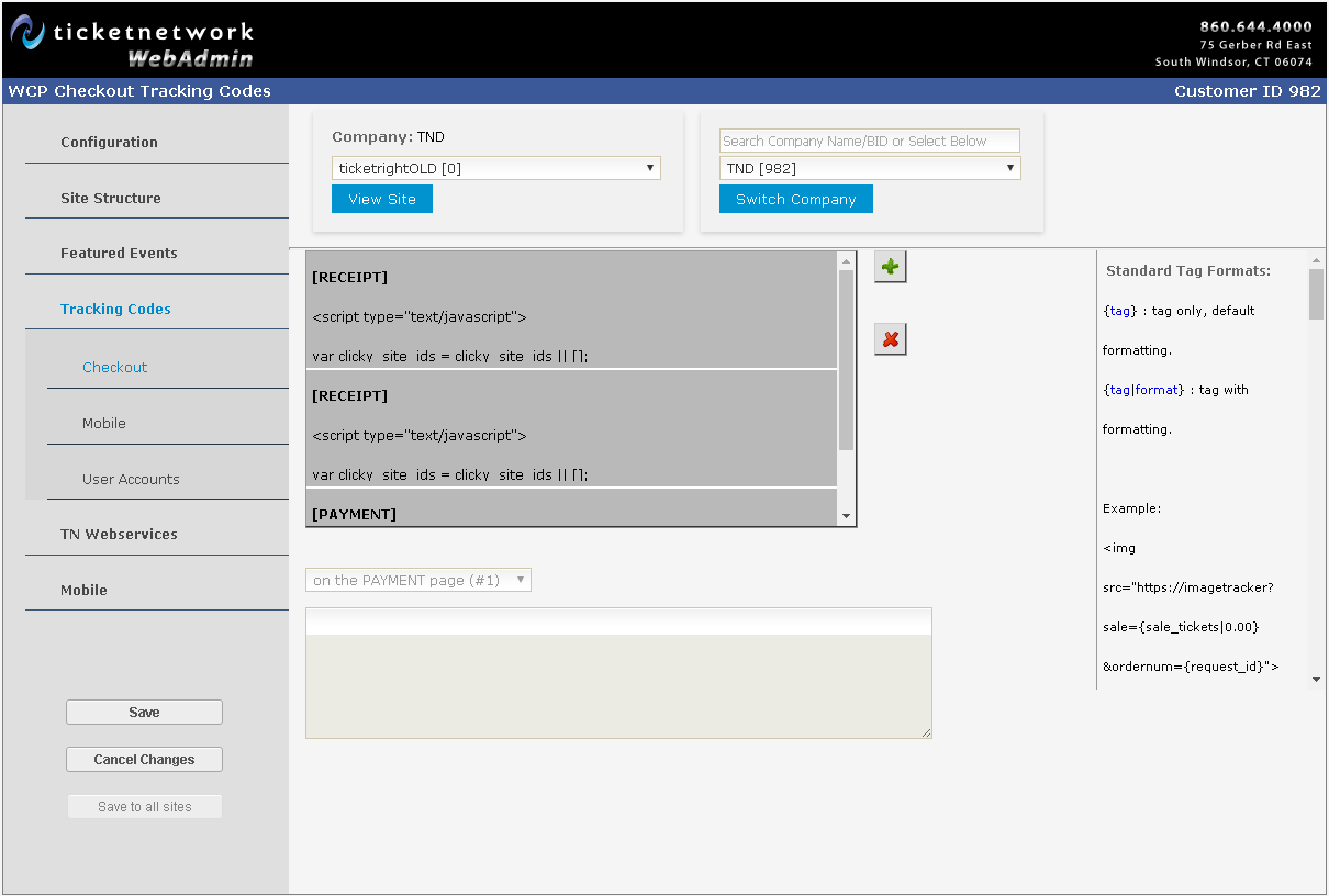
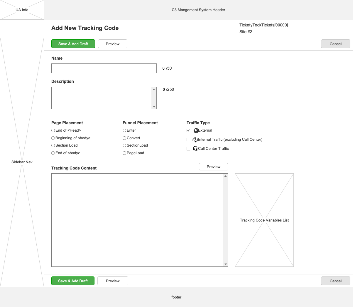
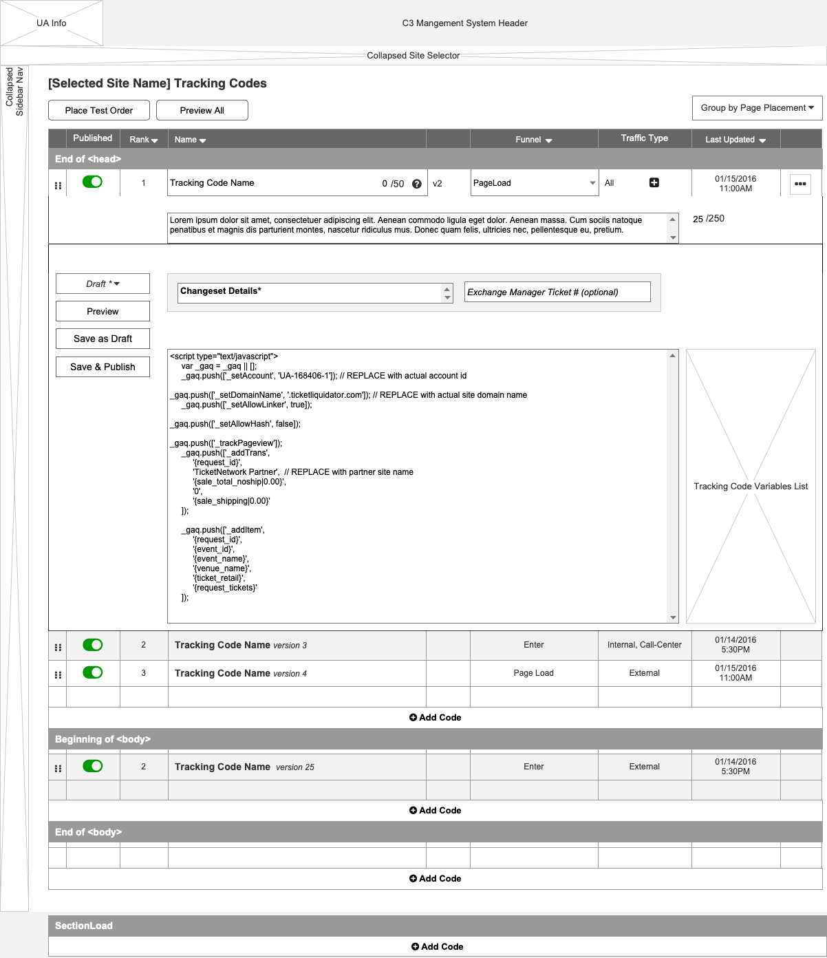
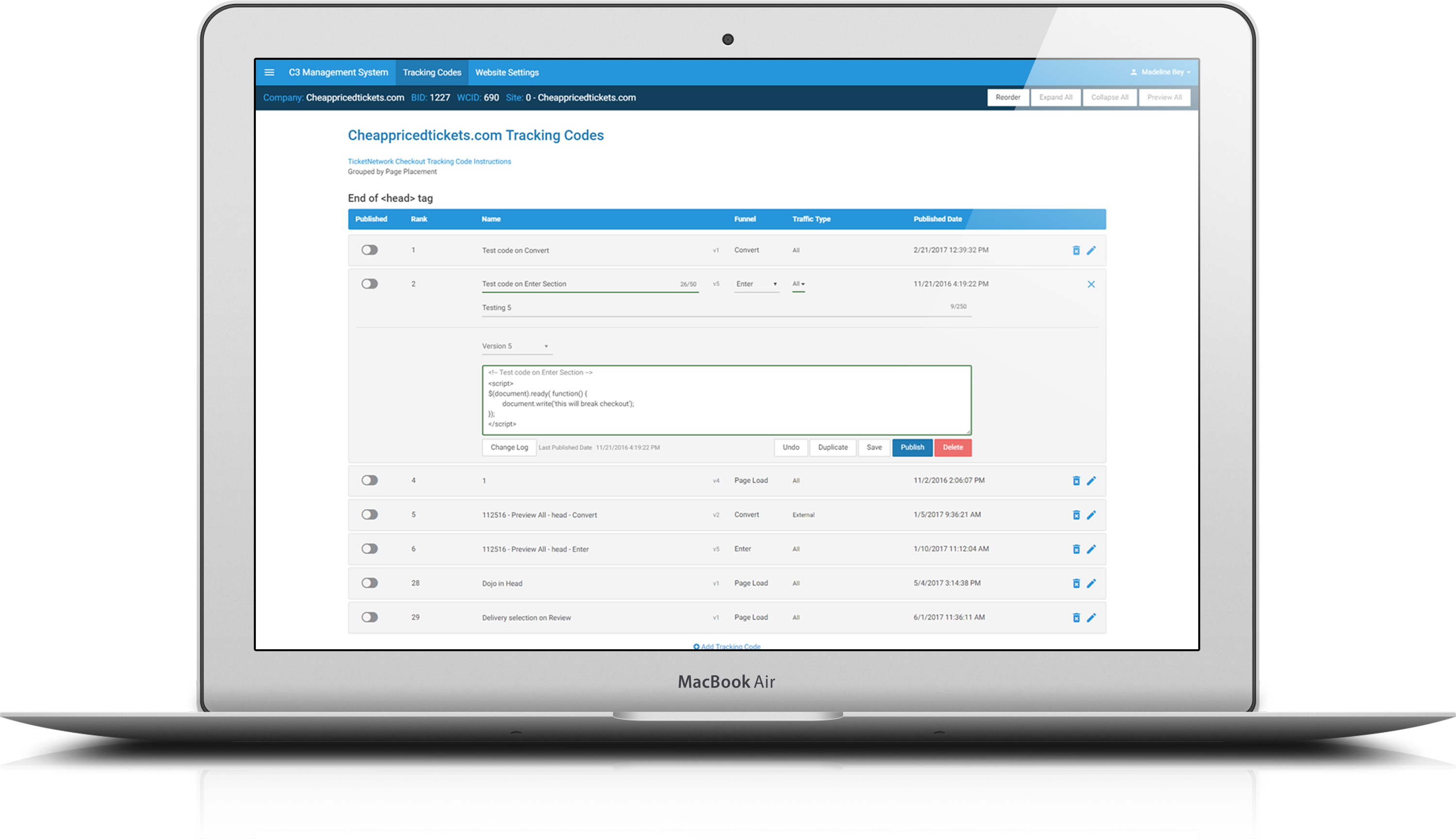
Tracking Code Management
Discovery
Research
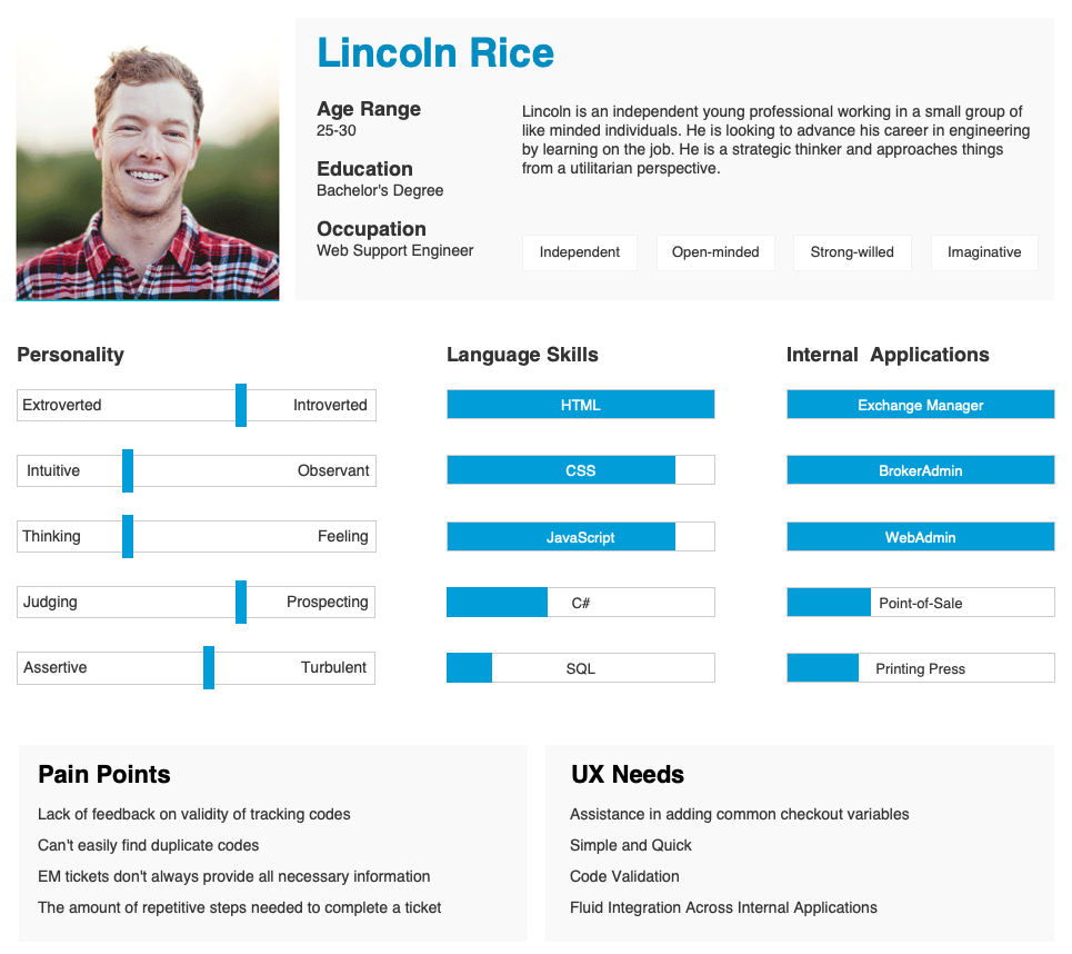
The main users of this interface would be the Web Support Team (WST), a 6-10 person team who implement and maintain the thousands of event ticketing websites for ticket brokers and sellers. It is seen as a transitional position for people looking for more experience to move up in engineering with web development. They were the team that was given all the grunt work the product teams didn’t want to do.
With the user base being internal, I took the opportunity to send out surveys to gather more information on their background, the internal applications they used, their daily workflows and any struggles they had and create a persona to help aid in the design.
Task & User Flows
I started mapping out how our users would go through the system at a high level to complete their tasks efficiently and help identify useful features.
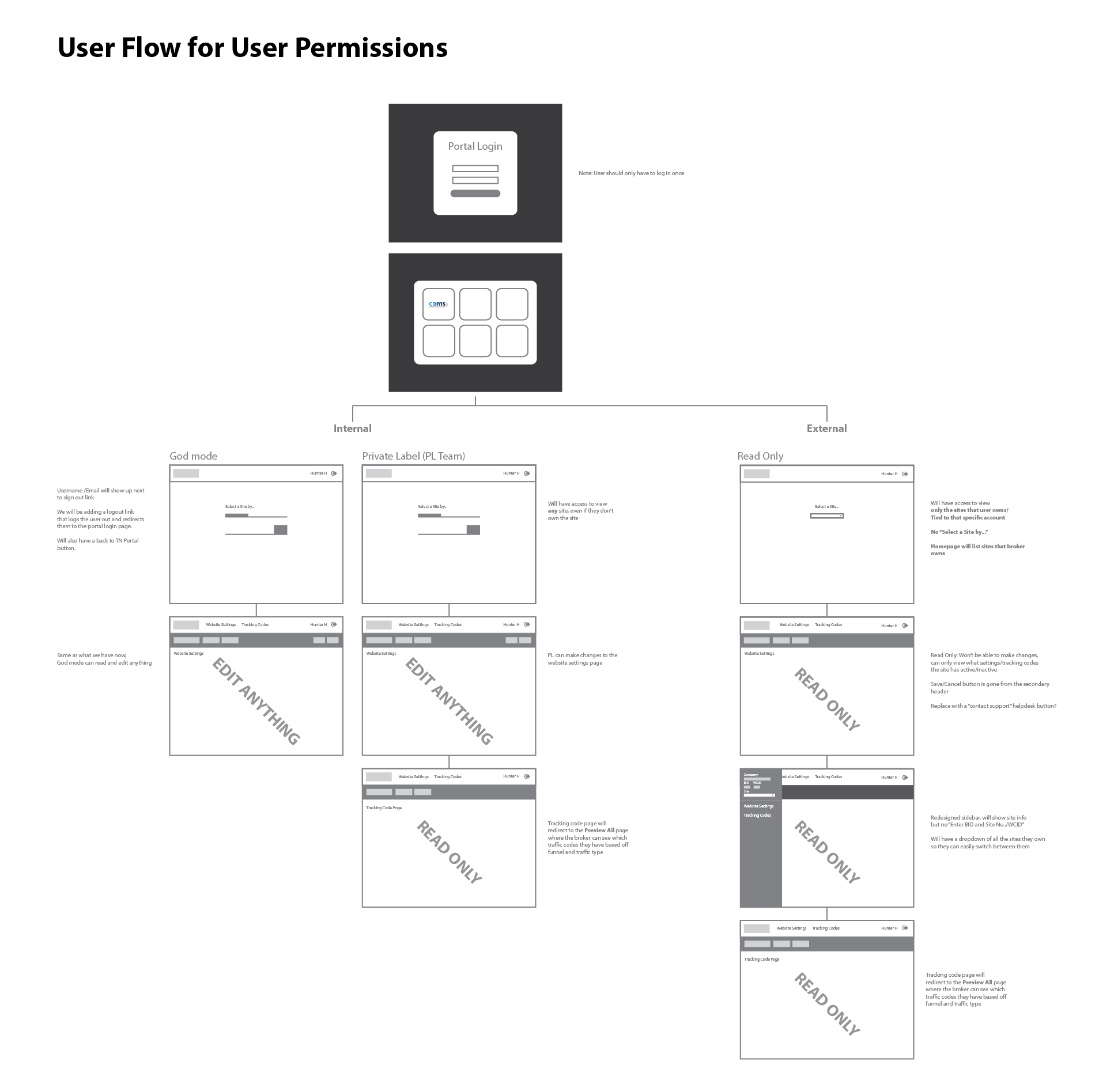
MVP Features
Based on my research and flows, I worked with the product owner to establish the four major features for MVP:
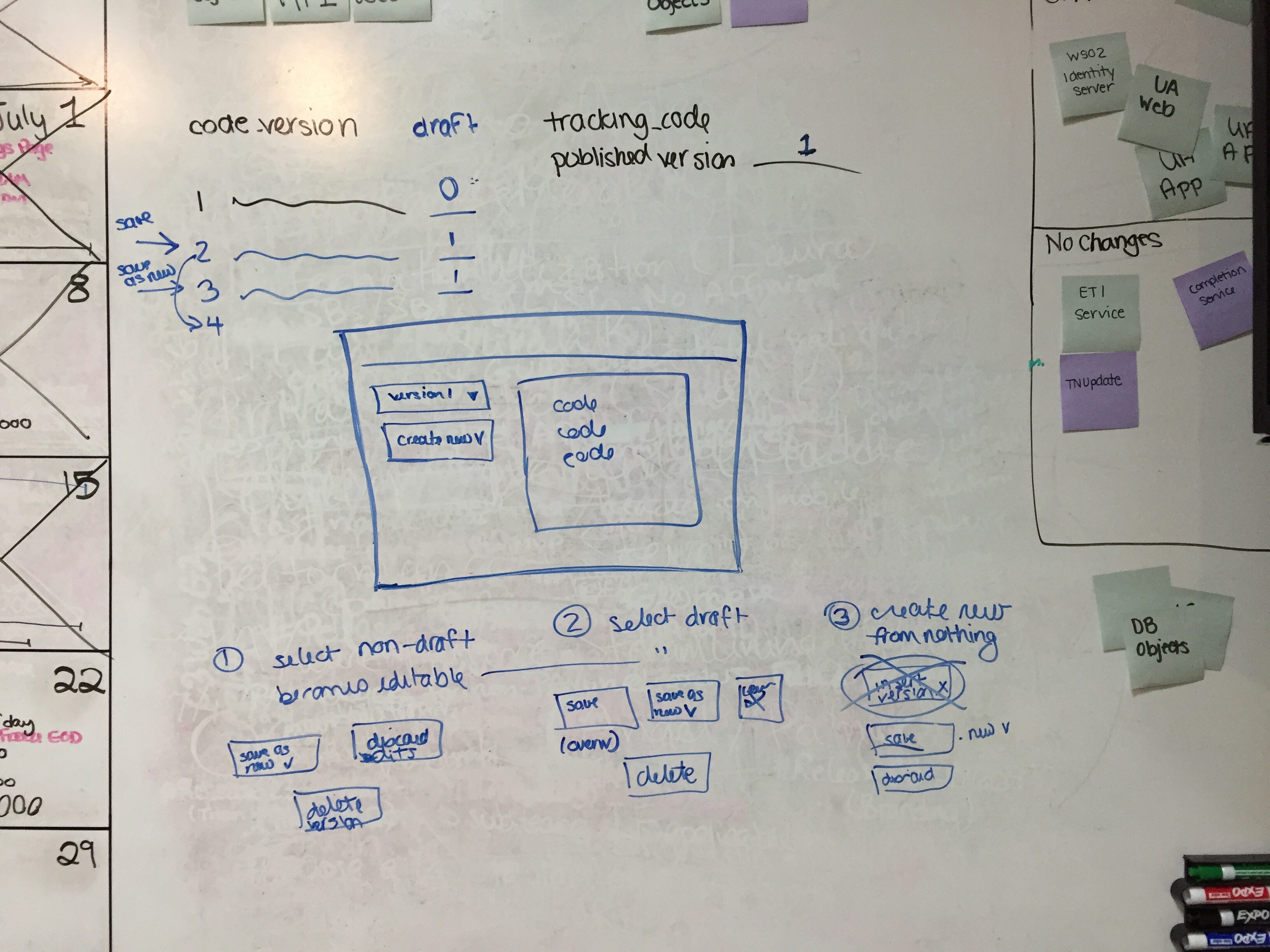
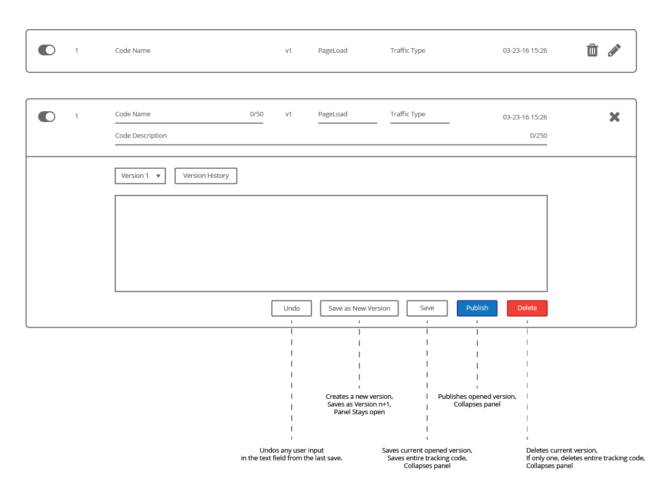
- Create, Replicate, Update & Delete a Tracking Code
- Version Control and Drafts
- Inline Validation of the User Inputed Code
- Ability to Quickly Test a Code by Placing a Test Order
Iterations
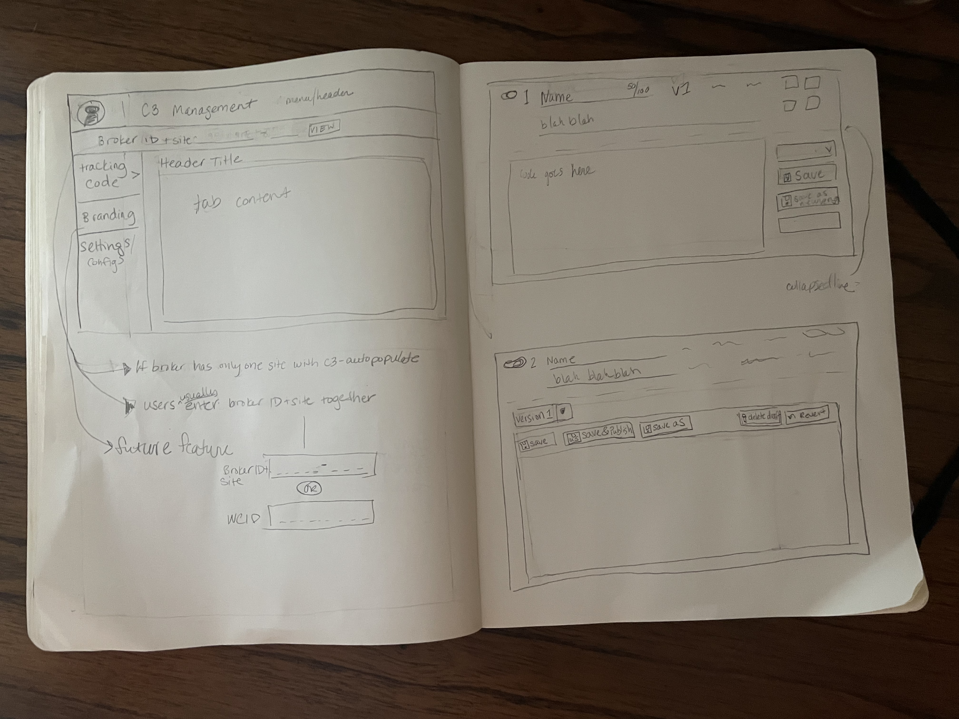
Sketches & Wireframes & Prototyping
I started out by quickly sketching different ideas for the overall layout, site selector and tracking code UI. I was able to quickly decide on the direction and move over to Axure to start wireframing and prototyping to figure out the details.
Testing & Refinement
The main objective of these user tests were to see how easily a Web Support Engineer could complete their daily tasks with the new settings and tracking code UI. I wrote, conducted and analyzed the test by myself. It was a cross between a “drive-by test” and a formal recorded session. I shared my findings with my team in a bulleted list and worked with the Product Owner to update the acceptance criterias.
Outcome
Impact
Although there system in place to quantify the success of the management system, the Web Support Team members were very happy with their improved experience.